Multiple thoughts...
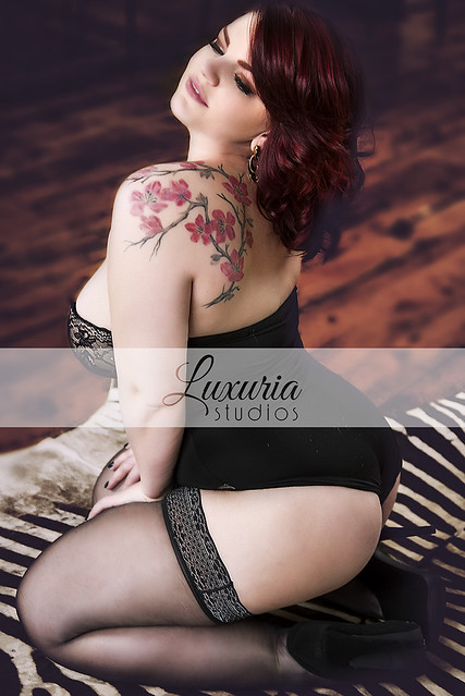
1. On the logo...depends up on the primary purpose. I think in most cases, it's as Trey and Jsecord....you want people to know it's you in order to get business. You've got a small, classy logo that looks lovely. The one branding question you should consider for that is if you want to use consistent placement (i.e.: lower left corner every time) or vary with the photo (so it's still there but doesn't detract). Pros and cons to each approach. As to the band....talk to a wedding photographer and they'll tell you how people steal proofs and make copies. So while I hate a band running across, I'm also not running a photo business and I completely understand the issue. I personally (for unpaid proofs) would be more likely to provide a lower quality photo with a large but faint logo in one corner that says "Luxuria Studio, sample (or proof). It's not perfect b/c many of your clients are just looking for photos for websites (so lower quality is fine for the purpose). The thing to keep in mind is that if someone REALLY wants to steal your work, they will and a logo won't stop it. So that's why I said it depends on the purpose. The small, classy logo in the corner encourages people to keep it there (rather than crop it) and hopefully gets you business. The proof version allows people to get a sense of the photo but still makes it a little tricky to try and steal it without paying you for your work.
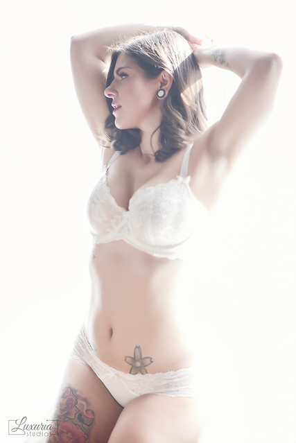
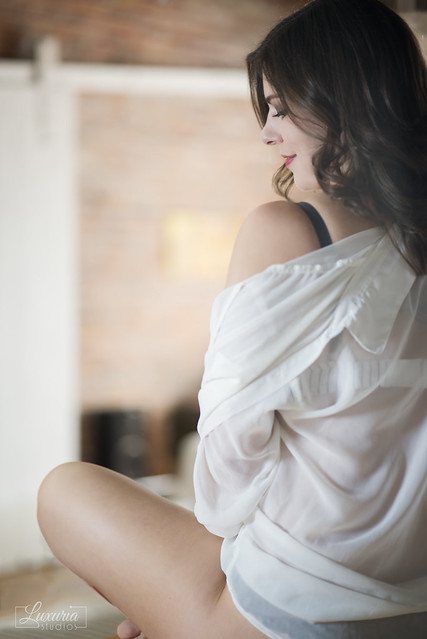
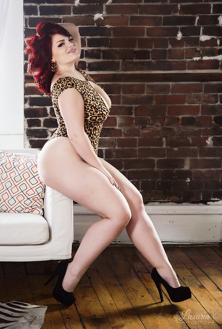
2. On the photos...your work continues to improve on many levels. Your use of backgrounds/backdrops, staging the photo is so much better than the initial work you first submitted. The poses are much better. You're producing photos that don't have a head cut off or a face blurred out yet still show the ability to get a good photo while protecting privacy. Lighting is much more effective...not as extreme range. Purely from a technical standpoint, your work has improved significantly since you started submitting stuff here.
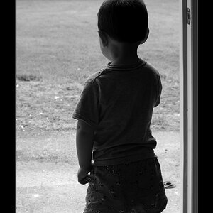
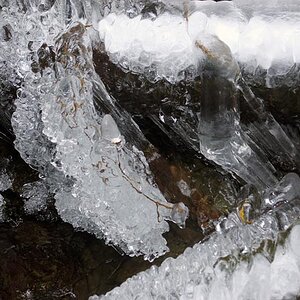
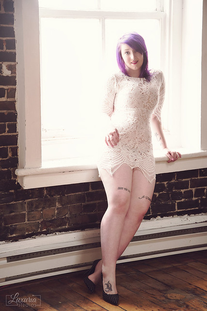
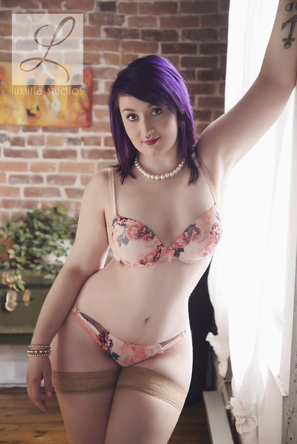
Personally, I love #3 and #4. Nice poses, lovely girl, good composition. #5--love the backlighting in her hair. #6 is also well done (though I think the angle probably makes her look heavier than she is). #1 and #2...nice photos but in #2 you cut off an arm (if you showed the rest of that arm going up, it would be a more interesting composition AND it would make her look a bit thinner). For #1, I think a slightly different pose--leaning against the window sill is going to expand those thighs, b/c her right arm is blow out, the right hand appears out of nowhere...to me that's the least effective of the 6 shots even though each photo has some appealing elements.
Good stuff--thanks for sharing!





![[No title]](/data/xfmg/thumbnail/36/36395-66eaff4565ecf4245f13a9c469a9273b.jpg?1734168775)
![[No title]](/data/xfmg/thumbnail/37/37132-262f6a30f085c3ab6d83925db41b553b.jpg?1734169835)
![[No title]](/data/xfmg/thumbnail/37/37130-15360a524d273bc7dcd0beda3e9299ee.jpg?1734169834)

![[No title]](/data/xfmg/thumbnail/37/37131-0af98967b391a8bd22ce1d14f6afb9cc.jpg?1734169834)
![[No title]](/data/xfmg/thumbnail/41/41821-2e92de82ffc4cd2d520a8fa10fb8b6a5.jpg?1734176138)

![[No title]](/data/xfmg/thumbnail/37/37519-6093821531f744039f3ac2b3e30c7dbf.jpg?1734170680)