What's new

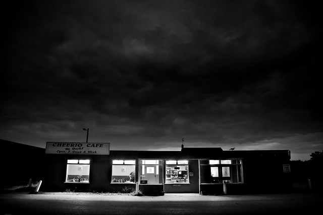
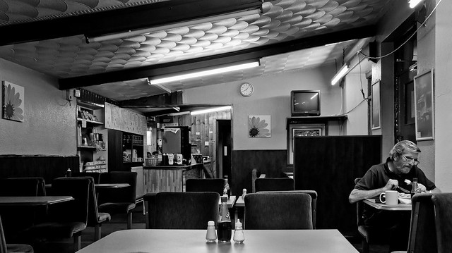
lone cafe at night

tamphotography

TPF Noob!
Joined
Sep 12, 2011
Messages
3
Reaction score
1
Location
nottingham uk
Can others edit my Photos
Photos NOT OK to edit
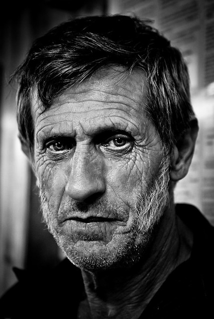
Absolutely digging that first picture.
I love the detail, I love that it's black and white.
I like the shadow above the eyes, it makes them pop out
I like how he's starring directly into the glass.

I think the cafe shot is cool too.
I wish the camera was placed further back and was able to capture more deserted/ empty space around it (if there was any).
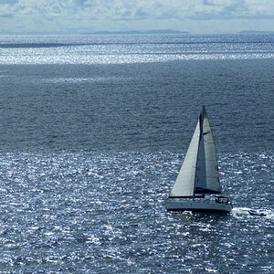
And maybe a slight HDR technique to show a tiny bit more detail to the clouds.

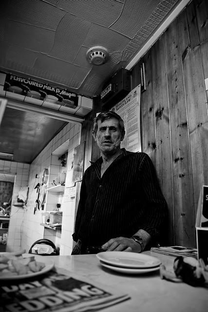
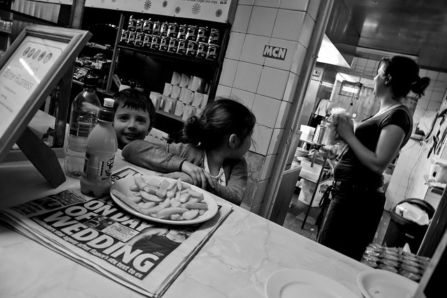
I don't have much comments for #3,4, and 5.

Good stuff.
 
The first is a great shot. The second doesn't have any interesting sky detail to justify that framing (see Ansel Adams, Moonrise over Hernandez, NM) and also there is a perspective problem that makes the cafe look like it's falling over. The last three are interesting in terms of composition and subject matter, but look flat, probably because they lack contrast in the mid-tones.
 
Very good work ! It reminds me the French humanist photography.

Please, what type of lens did you use ?

Thank you.
 
Last edited:
The first is my fave. What a story that man's eyes could tell. Thanks for sharing.
 
Sadness is in the air, and you captured it! Well done.
And honestly, that guy reminds of Iran's President:)
 
Love everything about the first shot. Amazing portrait. Exposure is spot on. A real winner.
 
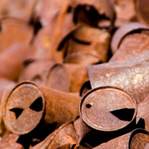
I like the chips one, it has a "documentary" feel but, that first photo just blows the rest out of the water! Great photo :thumbup:
 
I think this is a really, lovely series but I would present it slightly differently for maximum effect.
I would put #2 first - and see if you can get some more variation in the sky.

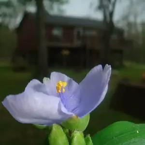
Then #5 - sort of a scene setting
then #4 - details
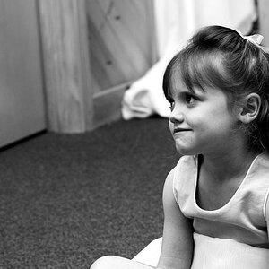
then #3 - seemingly follow on detail
then #1 to make the impact.

Showing #1 first, imo, means that everything else is a let-down - and there's no context.
I suggest you build up to it and then close with the strongest picture after you set th scene.
 
I think this is a really, lovely series but I would present it slightly differently for maximum effect.
I would put #2 first - and see if you can get some more variation in the sky.

Then #5 - sort of a scene setting
then #4 - details
then #3 - seemingly follow on detail
then #1 to make the impact.

Showing #1 first, imo, means that everything else is a let-down - and there's no context.
I suggest you build up to it and then close with the strongest picture after you set th scene.

+1 :thumbup::thumbup:
 

Create an account or login to comment

You must be a member in order to leave a comment

Create account

Create an account on our community. It's easy!

Log in

Already have an account? Log in here.

New Topics

Back
Top Bottom