bleeblu
TPF Noob!
- Joined
- Oct 9, 2011
- Messages
- 159
- Reaction score
- 58
- Location
- Alabama
- Website
- bleeblu.com
- Can others edit my Photos
- Photos OK to edit
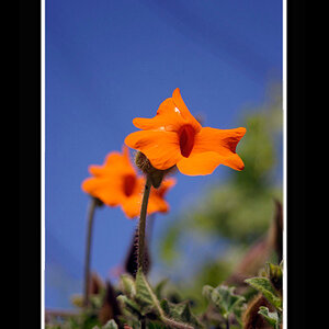
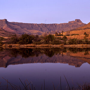
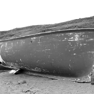
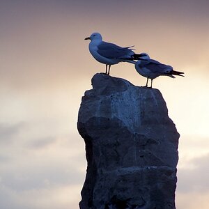
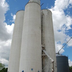
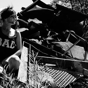
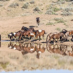
My friend and I disappeared into the woods to take pictures. It wasn't suppose to be serious at all. Just for me to get some pics to practice on Photoshop and to scout for cool locations. I didn't expect these to turn out as good as they did.
1

Untitled by Mark Harless, on Flickr
2

Untitled by Mark Harless, on Flickr
3

Untitled by Mark Harless, on Flickr
4

Untitled by Mark Harless, on Flickr
5

Untitled by Mark Harless, on Flickr
1
Untitled by Mark Harless, on Flickr
2
Untitled by Mark Harless, on Flickr
3
Untitled by Mark Harless, on Flickr
4
Untitled by Mark Harless, on Flickr
5
Untitled by Mark Harless, on Flickr
![[No title]](/data/xfmg/thumbnail/37/37090-2836dacbe52360ec3fdc1246a4e1d045.jpg?1619737880)


![[No title]](/data/xfmg/thumbnail/37/37092-c446ffb89610a57384a51ac5254beffd.jpg?1619737881)