Looking for C&C on Various Pics

mswiech

TPF Noob!
Joined
Jan 28, 2011
Messages
127
Reaction score
7
Can others edit my Photos
Photos OK to edit
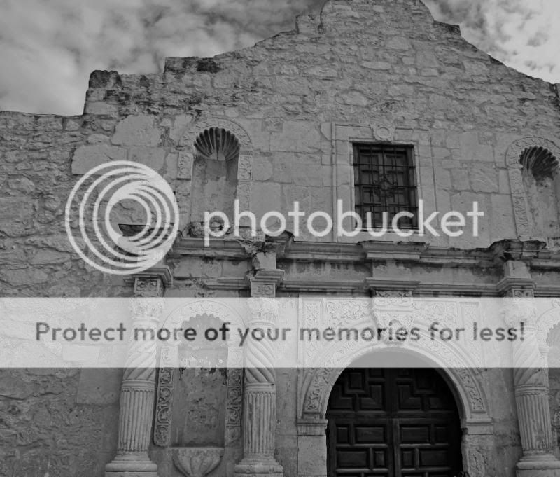
Hey everyone, Looking for some C&C on the various pics that I have posted below. Images 2 and 4 are of the same thing, but one is in color and the other is B&W. Thanks in advance.

1.
TrumpetFlower.jpg


2.
DSC_0115-Copy.jpg


3.
DSC_0114copy.jpg


4.
DSC_0115-BW.jpg
 
I think the b&w photos could use more contrast. There is a lot of neat texture to that building in the color that gets lost in the b&w.

first one is amazing.

nice shots
 
1. Isn't in focus and isn't interesting. Just a snap shot of a cool lookin' flower.

The rest aren't very sharp and don't really have a subject point.

The building shots would have been a whole lot cooler if you backed up and captured more of the building.
 
1. Isn't in focus and isn't interesting. Just a snap shot of a cool lookin' flower.

The rest aren't very sharp and don't really have a subject point.

The building shots would have been a whole lot cooler if you backed up and captured more of the building.

Thanks rockstarphotography and jcampbell.

With reference to you jcampbell. I did have a few full shots of the building, but there was a lot of other distractions in the pic (People, chain links and overhead wires.) I had to crop in to get a better looking shot and remove those other things that would have been in the pic.

What would you suggest to have as a subject point? My thoughts were that of the door as I really liked the color and how it popped in comparison to the building as a whole. For the 1st pic I was trying out DOF on the flower and to see what I could achieve.

Thanks again for the comments.
 
I think farther back and maybe catching the steps going up toward the door would look a little better idk thats just me. overall I like the texture of the building. Good Job!
 
composition composition composition. and focus.

:D
 
1. Isn't in focus and isn't interesting. Just a snap shot of a cool lookin' flower.

The rest aren't very sharp and don't really have a subject point.


+1

The colours in #1 are striking, but it's OOF. The B&W's seem to lack depth and because of the lack of colour, a lot of the detail is lost. I'm sure if you have a play around with these you'll get something though.
 
Thanks everyone for the comments. Its a learning curve (was just a point and shoot person before) only been really serious into taking photos in the past few months, so I do take the comments and will try and work on them to improve. I will post more
 

Most reactions

Back
Top