Looking for CC

N1kon1k

No longer a newbie, moving up!
Joined
Dec 5, 2015
Messages
151
Reaction score
39
Can others edit my Photos
Photos OK to edit
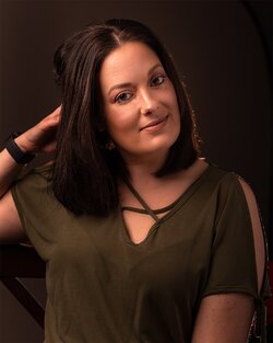
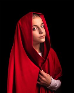
hey everyone been reading and studying portraits and lighting and finally decided to jump in and start the physical aspect...
Looking for some criticism as to what I did right and what can be improved... all help greatly appreciated.
 

Attachments

  • 27EECA95-314A-4B0D-9351-B4E518245EE1.jpeg
    27EECA95-314A-4B0D-9351-B4E518245EE1.jpeg
    237.5 KB · Views: 257
  • 6BAAC037-F5ED-42D3-B9EE-8FEBB632E411.jpeg
    6BAAC037-F5ED-42D3-B9EE-8FEBB632E411.jpeg
    190.6 KB · Views: 263
  • 6B59129C-7DEE-4DFA-AEE0-345A7F8AC74E.jpeg
    6B59129C-7DEE-4DFA-AEE0-345A7F8AC74E.jpeg
    183.7 KB · Views: 259
A nice start! A few thoughts for consideration... in #1, it feels a bit too red and just slightly underexposed. I would have preferred not to see the bit of chair or whatever is visible below her right arm. In #2, the DoF is a bit too shallow for my taste, however that's a very personal thing. The last is my favorite of the set. I would like see her chin down a bit, and some of the red spill on her face corrected.
 
Thanks for sharing your work! I wish my first portraits had been as good as these! Good job!

The first thing I like about these photos is their sense of calm and quietness - these two women appear comfortable in front of your camera and not pretending to smile for the camera. You have directed them to show a genuine and calm demeanor that I find very appealing. I like the classic appeal of the third image with the red serving the function of a frame within the frame and directing the viewer to the woman's face. On the center photo, the color palette works really well, with her hair tones and the background unifying to create a harmonious olive color to match her amazing eyes. I also like how you've separated her from the background with a back light. And the shallow focus seems to work well too. Very nicely done. The second and third are my favorites for the classic simplicity and the expression of the model.

The first image has some unessential elements - her watch or bracelet, the stuff on the bottom left, the curved lines on the background, the pose of her hand and how her hair moves up, the rim light - these are details that don't add to the portrait, and if they don't add, they take away. Watch rim lights as they can make a fine portrait look contrived and more about the photographer than the person being photographed; let the light tell the story about the person in front of the camera, but the light should rarely be the story itself (there are exceptions, of course)

Great start and looking forward to seeing more!
 
Great start!! In addition to the above comments, on the first I'm not a fan of the double trunecated arm. Number two the hot spot in the corner of the eye socket is annoying, and in the last the red appears a just a tad oversaturated.
 
A nice start! A few thoughts for consideration... in #1, it feels a bit too red and just slightly underexposed. I would have preferred not to see the bit of chair or whatever is visible below her right arm. In #2, the DoF is a bit too shallow for my taste, however that's a very personal thing. The last is my favorite of the set. I would like see her chin down a bit, and some of the red spill on her face corrected.

Thanks for the feedback, now that you mention about the spill I can definitely notice it... comp is definitely off on the first one... best of the bunch since I was having a hard time making her feel comfortable and natural. Gotta practice a lot more on social skills lol
 
Thanks Texxter great input on the rim light, never thought of it that way, will definitely take that into consideration as well going forward... one thing I learned while in post is to next time for rim light perhaps use a soft box for a much softer light and perhaps a grid to direct and control the spill... bare flash not such a good idea..
 
Thanks Smoke665 that hot spot you mentioned it was definitely a concern I was having in post that I also didn’t like, any thoughts as to how fix it in camera or in post? I would rather know how to fix it in camera to minimize post processing time... as far as the saturation, I definitely cranked that sucker up for a dramatic look, perhaps I should tone it down lol
 

Most reactions

Back
Top