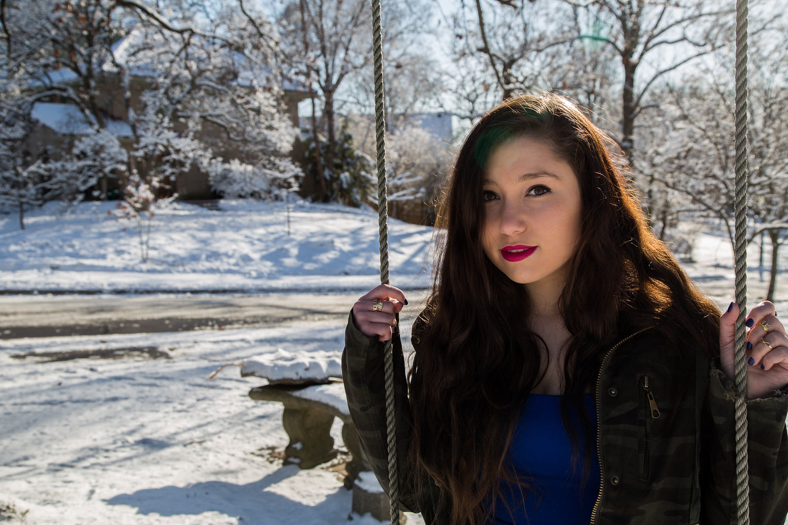
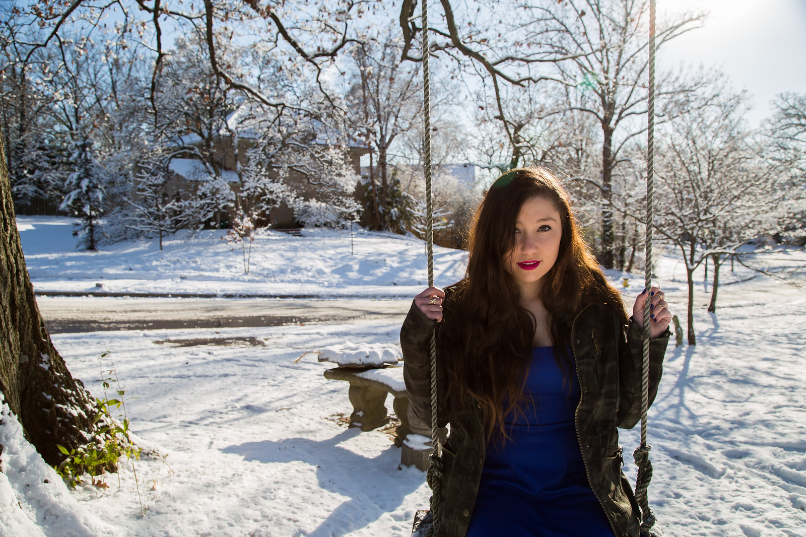
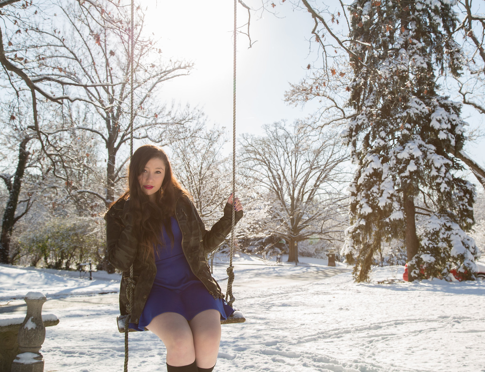
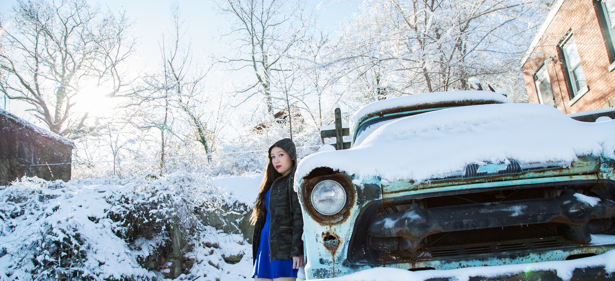
IMO the 1st 3 should be in the vertical framing, not as horizontals, and the depth-of-field should be quite a bit more shallow giving the girl more visual weight in the photograph..
The color temperature of the light used for fill is to warm compared to the rest of the shot, and the light direction is from quite a bit lower than I would have had it.
Her cheeks are casting a shadow under her eyes from the low position.
I'm guessing a gold reflector was used.
If so, had the camera's white balance had been set to tungsten/incandescent, the fill light would be close to white making for more natural looking facial skin tones, and the background light would have been even more blue.
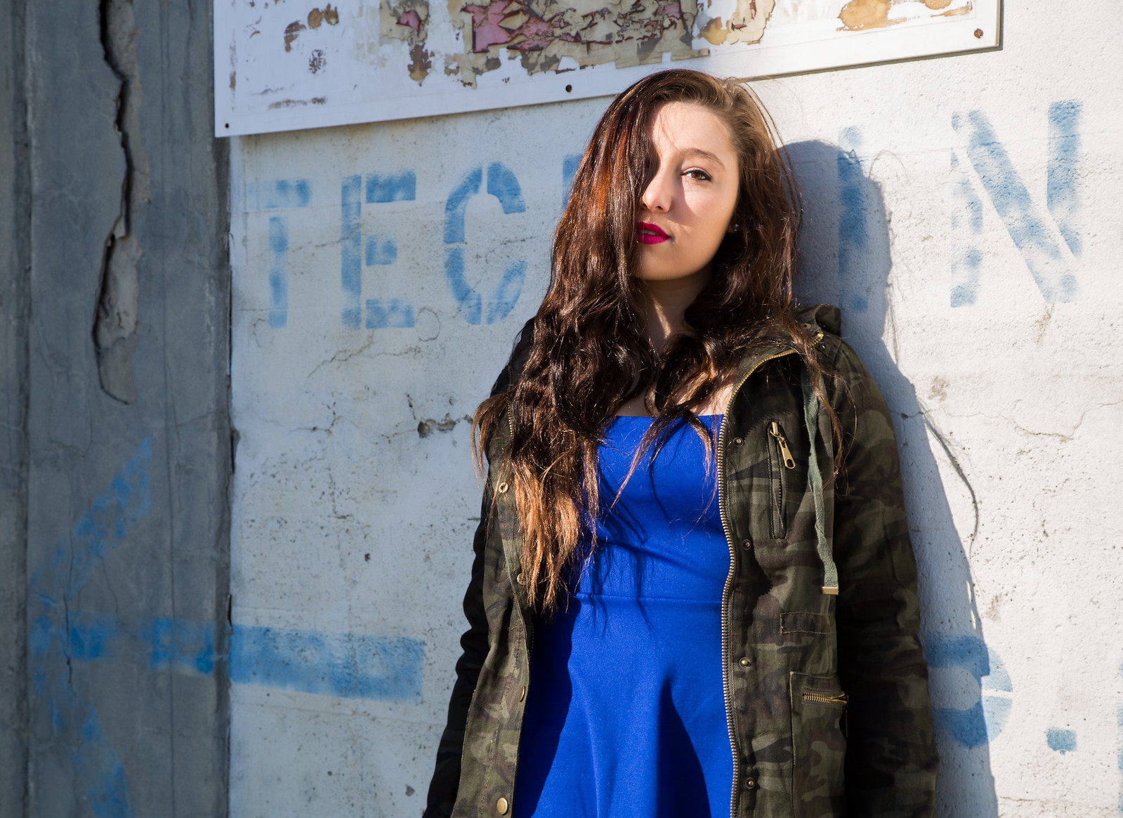
I'm not a fan on the light quality and direction where shes up against the wall.
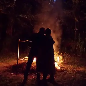
The last one! No workie - composition, framing, subject scale, pose, truck, crop.





![[No title]](/data/xfmg/thumbnail/34/34556-60d61b1903f6554f7373cddfe5823280.jpg?1734165526)