What's new

Looking for critique.

tedfoto

TPF Noob!
Joined
Jul 8, 2011
Messages
50
Reaction score
2
Location
Chicago
Can others edit my Photos
Photos NOT OK to edit
Howdy ya'll.

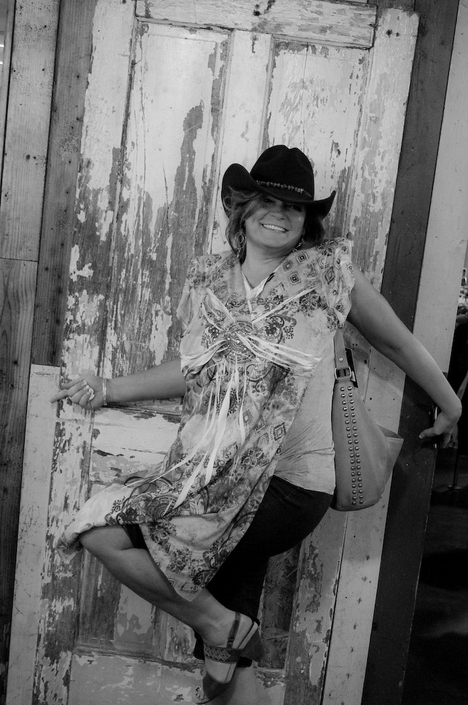
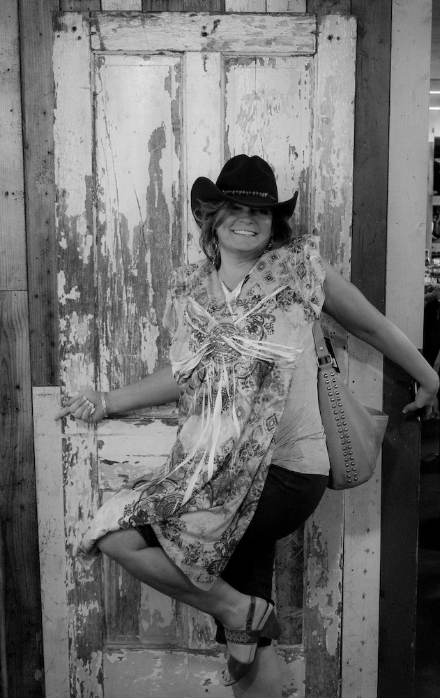
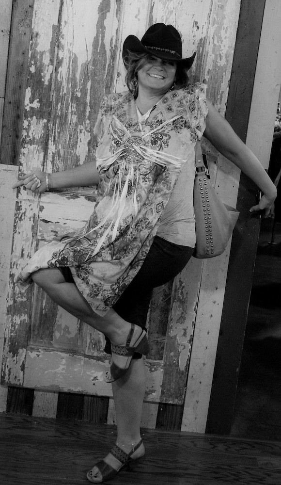
This photo was in a rather dark clothing store (shot with no flash, at ISO 1600). Kept the shutter speed as fast as I could manage (1/50th sec.) with only a max aperture of 3.5. Thought it would turn out pretty well, but after I loaded it into Lightroom, it was certainly not flattering. I did my best to salvage it and make it a fun picture...just looking for some feedback. What do you expect...I'm a noob.

Original:
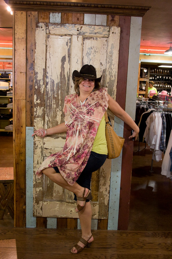
Cavenders orig compare-1 by akimbo canons, on Flickr

After Processing:
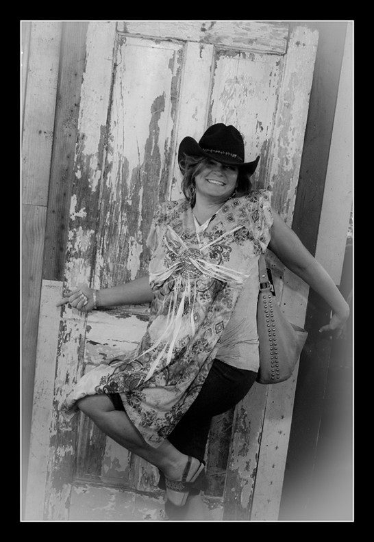
Cavenders 4 rezd brdr-1 by akimbo canons, on Flickr

Thanks ahead of time for your constructive criticism.
 
There is too much clutter in the original, the exposure isnt terrible. The B&W has too strong of a vignette imo, and the subject doesnt stand out against the background well enough.
 
I'd leave it colored version and just crop away from the side and top, to start.
 
I think the BW works much better, but lose the vignette and crop just a little less on the bottom so you have the entire left foot.
 
What I find distracting is the store is tilted...look at the door she's standing in front of and wall at the ceiling in the rear of the photo
 
I wanted to put the focus more on the facial expression, so I went out on a limb (so to speak) and decided to sacrifice the leg so I could get in closer. Also, the processed version is intentionally tilted to add some dynamic, and I thought the tilt would feel less unnatural if the floor and ceiling were cropped out. I'll definitely reconsider before amputating in the future. Thanks for the comment!
 
There is too much clutter in the original, the exposure isnt terrible. The B&W has too strong of a vignette imo, and the subject doesnt stand out against the background well enough.

Here's another without the vignette.

Cavenders 5 no vig-1 by akimbo canons, on Flickr
I have to agree it looks cleaner without it. As far as not standing out against the background, should I have maybe lowered the contrast of just the door in PS? Either brought the highlights of the door down, or the darker spots up?
 
The biggest problems I see here are the tilt and the leg chop. More so the tilt
 
What I find distracting is the store is tilted...look at the door she's standing in front of and wall at the ceiling in the rear of the photo

Here's an untilted version (actually more straightened than the original).


Cavenders 5 straight crop-1 by akimbo canons, on Flickr
I agree it is less distracting, and more "sober"-feeling, maybe even less "sea-sickness inducing". But I do feel like the slight tilt (unless I just used too much) adds something...some excitement, or energy to the image, especially since she decided on that pose. Is tilting always a bad idea? Thanks again for the feedback. I'm learning quite a bit.
 
I liked the colors in photo, except for the way the colors of the clothes she was wearing when next to the dress she was holding up to her. The colors seemed to clash in a bad way for me, and I was hesitant to change the hue in PS, so B&W seemed like the best option. However, now she doesn't stand out against the door very well. Here's another with the leg reattached.

Cavenders 5 add leg-1 by akimbo canons, on Flickr

Thanks for your input, my friend!
 
I am confused... what vignette are you talking about? Am I mixing up the border with a vignette?

In the processed version w/border, there is a white vignette inside the edges of the border & white keyline. You can notice it especially in the bottom right corner over the shadows.


Cavenders 4 rezd brdr-1 by akimbo canons, on Flickr

Maybe too much, maybe not enough to notice it's there at all lol! Thanks for the input.
 
This is all just my newbie perspective, I'm not at all a fashion photographer, not by any means,(nature is my thing) so this is out of my depth.

Someone mentioned this but I'm not sure the OP caught it. The cropping of the leg doesn't bother me, but the cropping of the foot does. Leave a little extra space there and crop it a tad lower on the leg. Even in the full length crop, you've chopped it too close to the toe, gives is a pinched feel that's totally against the grain of the 'free' feeling of the pose


I'm not a fan of white/light (or colored) vignette. I've yet to see one I truly loved. The only vignette I ever use is black, but that's JMHO.

Also the tilt doesn't bother me, I agree it adds a dash of something the straight version lacks. What to call it? heh, your guess is as good as mine.

Also I'd also burn out those clothes racks in the background, even with the Vignette there's a distraction coming from the bright spot.
 

Create an account or login to comment

You must be a member in order to leave a comment

Create account

Create an account on our community. It's easy!

Log in

Already have an account? Log in here.

Back
Top Bottom