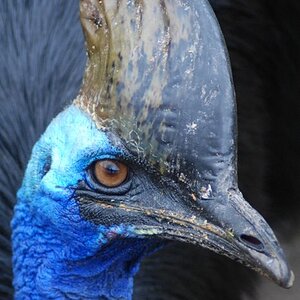
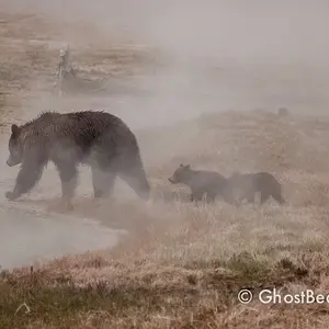
lol no thats exactly what im lookin for...the harshest critique is the best. u thnk the water mark should be less bold and more transparent im asssuming...and yea, ive been reading up on angles and lighting recently. im new gettin into this and i'm trying to learn instead of just jumpin out there like every1 else with a digi camera ya kno?
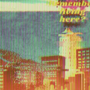
is it also a good idea to stay away from effects such as the one in the first picture?
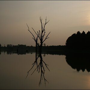
In my opinion your 3rd image is your best but it could be better if the entire picture was bw and no selective coloring. I'll repeat myself, don't do selective coloring. If you repeat shots like #3 (bw no color) your off to a good start. The watermark isn't distracting.
they suck...harsh enough? lol just messing. But seriously the only picture that I would say i like is the hollywood tower, and that one is messed up by trees covering the sign. The flowers are nice shots, but they look 2D...take it from an angle so you really get that 3 dimensional feel.