
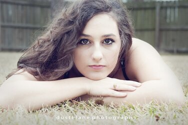
dustilanephotography
TPF Noob!
- Joined
- Jan 29, 2014
- Messages
- 10
- Reaction score
- 3
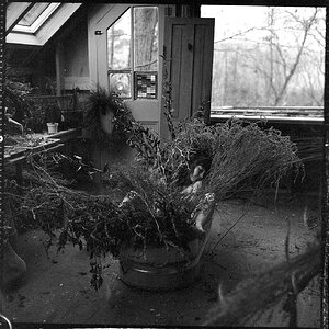
Have been taking pictures for awhile now and I have definitely improved (if you could see my order pictures you would laugh!) but I know I have a long way to go before I'm where I'd like to be. Can you please give me some constructive criticism on both editing and the image itself? Thank you.

")


![[No title]](/data/xfmg/thumbnail/38/38720-f0f83c1b09a42065eefec8923841d54d.jpg?1619738701)


![[No title]](/data/xfmg/thumbnail/37/37490-9848752f4de5e403f7f20db193e0fb64.jpg?1619738111)


![[No title]](/data/xfmg/thumbnail/33/33876-69ae4c2723e06d63117dc3b1b6629647.jpg?1619736182)