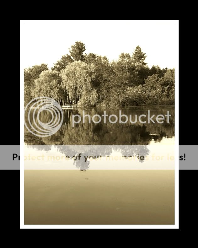
I wish the first one was more horizontal. It's so close that it really sticks out. Otherwise.... you know I'm a fan of your pictures. I recognize that sepia tone as your hallmark but can't help to wonder if you are going to branch out and show us some more styles? Or have I just joined
during your sepia phase?
Hey! Thanks for the feedback! I'd like to go back and try again....maybe early some morning when the water is like glass....and maybe there'll be a more interesting sky....yep--need to go out and try again!!
Sepia....ah yes, my friend 'sepia'!! LOL!! I don't know...I just really like it!! Also...In this case I felt that with all the texture of the trees, and water it might look better in sepia, rather than have the colour fighting against the texture?? Dunno?
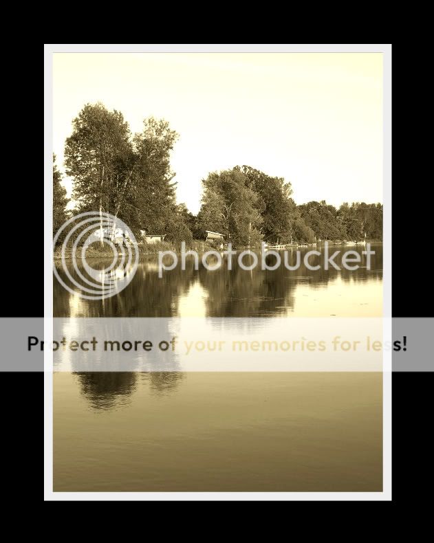
I like the first one very much. The second didn't excite me.
The water is very pretty and the reflection and colors in the water are awesome. The sky is kinda unfortunate and should probably be minimized even more... or go back when there are some interesting clouds and pull it off again.
BOTH seem tilted slightly.
I found myself wanting the first one to be more landscape than portrait.
I like the portrait setup for these, and yes, the horizon in the first could be straightened, but please don't for your second one. I think the diagonal of the shore is quite pleasing.
Hey! Thanks for the feedback everyone! Yeah...I realize that both are a wee bit tilted ....but I don't have a program to fix that (yet...maybe someday!!) LOL!!
I tried 'portrait'...just because I thought it might be "different"....in a good way!!
It does seem to be a bird in the reflection...and I agree...it would be nice to see him in the sky as well....aw yeck, what can ya do!! There is also something in the first one...a fish maybe...a lily pad...dunno...but it makes me crazy when I look at it!
The sky is definately most disappointing!! ...I am planning on going back to try again....when I get a chance!!

 ....but I don't have a program to fix that (yet...maybe someday!!) LOL!!
") There is also something in the first one...a fish maybe...a lily pad...dunno...but it makes me crazy when I look at it!
There is also something in the first one...a fish maybe...a lily pad...dunno...but it makes me crazy when I look at it!
![[No title]](/data/xfmg/thumbnail/37/37607-69784b19e25bd0ba68e92ff4cfdfa8ff.jpg?1619738148)
![[No title]](/data/xfmg/thumbnail/31/31085-9786bf0c16c072633ecdfad477c23095.jpg?1619734600)

![[No title]](/data/xfmg/thumbnail/31/31088-b509581dfd5e8b6b36c83266751654fc.jpg?1619734604)
![[No title]](/data/xfmg/thumbnail/31/31086-ae0d6678ca78859132ce5375d5300961.jpg?1619734602)