What's new

Lou

Milky

No longer a newbie, moving up!
Joined
Aug 11, 2009
Messages
233
Reaction score
152
Location
Munich, Germany
Can others edit my Photos
Photos OK to edit
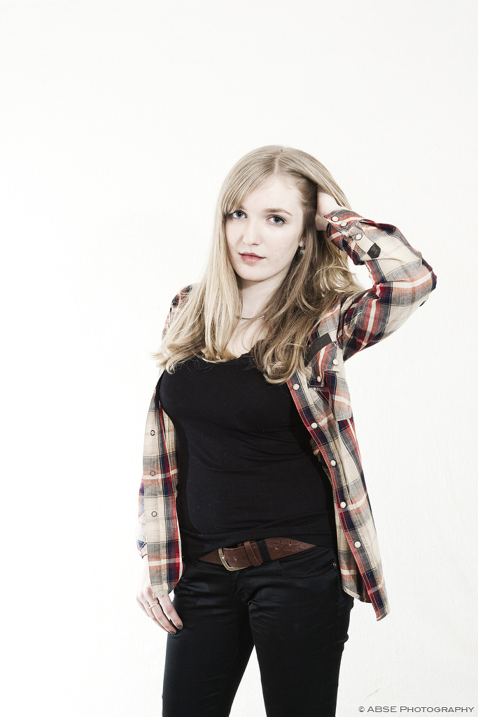
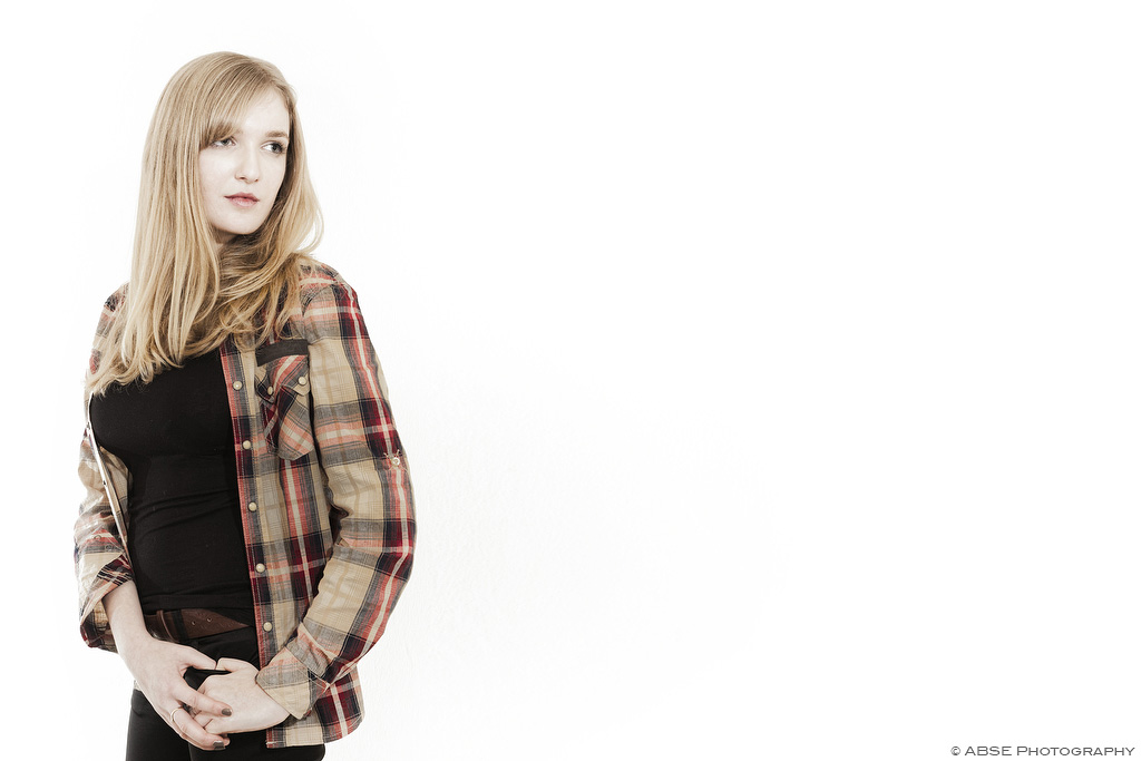
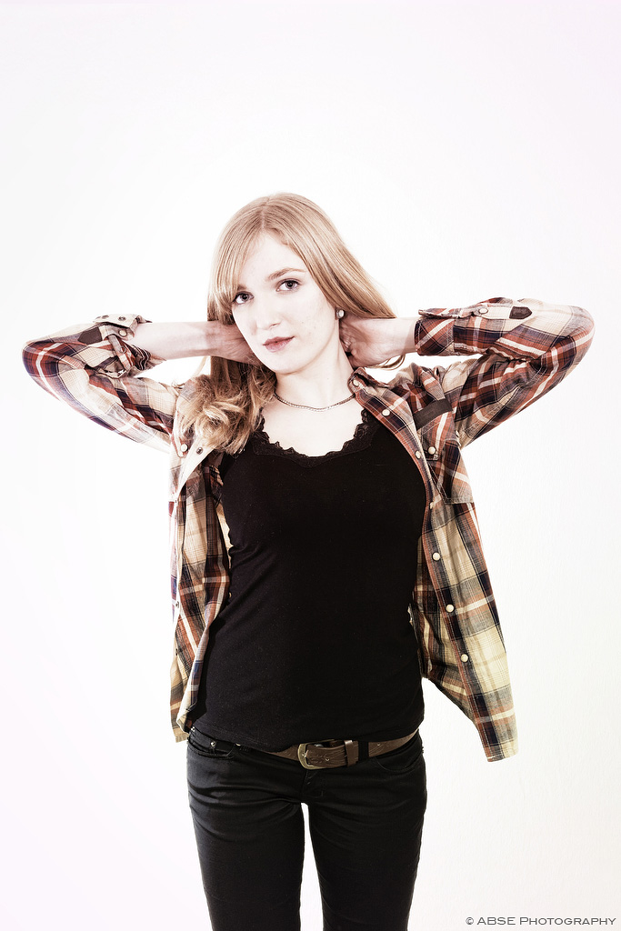
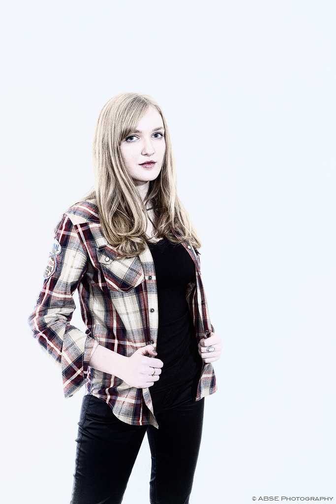
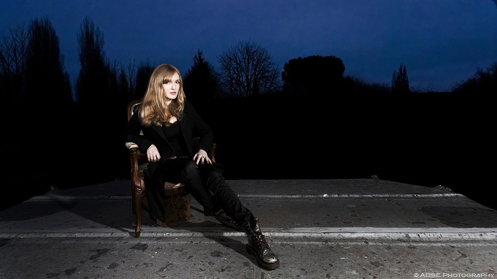
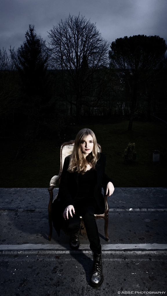
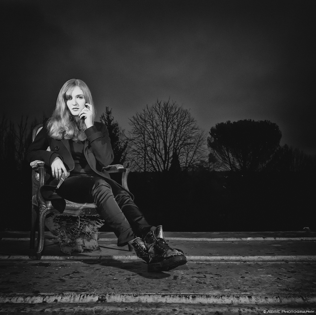
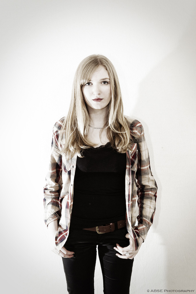
I did this shoot with Lou, and would like to have feedback on it. Thanks!

1
Dacryma_IMG_8805.jpg


2
Dacryma_IMG_8809.jpg


3
Dacryma_IMG_8812.jpg


4
Dacryma_IMG_8817.jpg


5
Dacryma_IMG_8818.jpg


6
Dacryma_IMG_8549.jpg


7
Dacryma_IMG_8521.jpg


8
Dacryma_IMG_8540.jpg
 
Last edited by a moderator:
As there are too many images for which to provide detailed, individual critique, I'll address them in two groups. In the first group, I very much like the posing and gneral concept, but WHY did you choose to light someone wearing a black shirt & trousers in this manner? High-key lighting is supposed to produce low-contrast images, so white/light clothing works best. Unfortunately, in these you've lost detail in the clothing, and there are some odd white balance issues as well. Given her colouring , I would suggest trying a reshoot with light blue/green pastel tones.

The "low key" images have an interesting look, but I think some fill was needed in the form of a large SB or similar with just enough light to let us see some detail. I don't find the posing as appealing in these as in the first group, but they're an interesting set, regardless.

Just my $00.02 worth - YMMV

~John
 
the last is the strongest of the series, but you went too far with the NR/clarity.
 
As there are too many images for which to provide detailed, individual critique, I'll address them in two groups. In the first group, I very much like the posing and gneral concept, but WHY did you choose to light someone wearing a black shirt & trousers in this manner? High-key lighting is supposed to produce low-contrast images, so white/light clothing works best. Unfortunately, in these you've lost detail in the clothing, and there are some odd white balance issues as well. Given her colouring , I would suggest trying a reshoot with light blue/green pastel tones.

The "low key" images have an interesting look, but I think some fill was needed in the form of a large SB or similar with just enough light to let us see some detail. I don't find the posing as appealing in these as in the first group, but they're an interesting set, regardless.

Just my $00.02 worth - YMMV

~John

Hi John,
Thanks for your input.
Regarding the lighting, never thought about the fact that she wore mainly dark for the high key. That was a quick homemade set up they wanted to use when I got there and seeing the black shape of the back white sheet and the lack of space, just decided to light the back to make it disappear as much as possible. Thanks for the input though I will try to keep this in mind for my next shoot!

Yes, regarding the second part of the set a little bit more detail would have been great, we lost too much time doing the set-up, mode detail in the background would have been great IMO. Will keep in mind to try to get the lighting to give more details!
 
Cheers. Yeah my Post processing skills were a bit low at the time I processed this specific image indeeed.
 

Create an account or login to comment

You must be a member in order to leave a comment

Create account

Create an account on our community. It's easy!

Log in

Already have an account? Log in here.

Back
Top Bottom