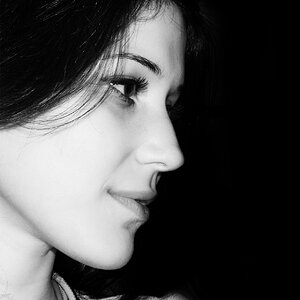
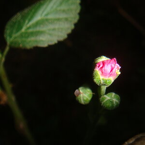
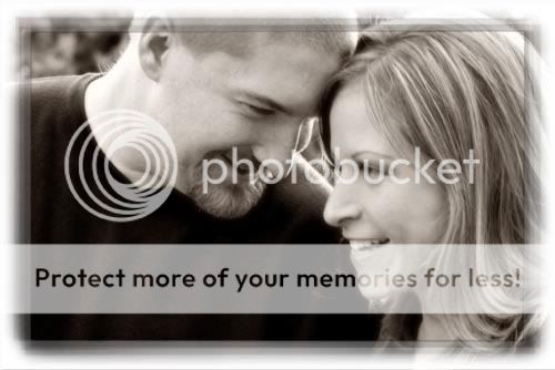
Yeah it came out blurry which is why I ended up giving it more of a glow and some grain and the sepia tone because I felt it made it look good still. I was trying to capture them natural and at that moment when I snapped he grabbed her and got that motion blur I was not going for
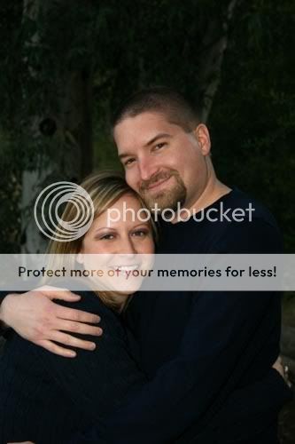
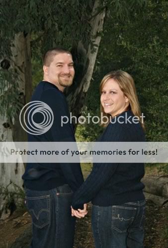
I think they could use just a touch more contrast - the second one especially seems flat. I'm surprised you got such a relaxed smile from the guy, they're usually so uptight during these things!
you got lucky with that guy! I'm dreading one of my upcoming engagement shoots! Both the bride and groom are VERY shy and can be uptight. Thankfully my next shoot is for a really relaxed couple so I'll just enjoy that one and try to forget the upcoming shy couple LOL.
Anyway.. they look good.. I'm betting the couple will be very happy. I would add a bit more punch to the pictures if they were mine. For example.
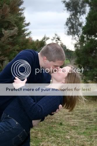
All pretty cute. Nice expressions and such. The dude has some weird mark on the bottom of his sweater in the second one, but you could clone that out.
I think a lot of them are a little overly-centered and in many cases don't take up enough of the frame (though cropping will help that).
I would shapen most of these a bit, give them a bit of contrast and saturation, but I can't say how much- I don't trust this monitor as far as I can throw it.
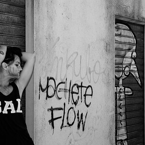
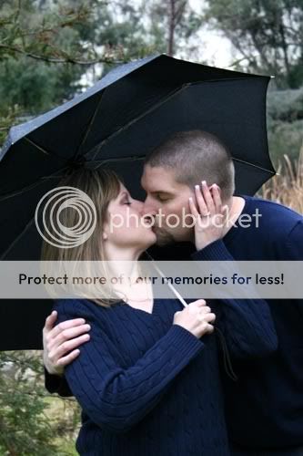
#3 is AWESOME. I don't like the border treatment and I might not have done such a soft PP treatment to it, but I think the picture ROCKS.
ahaha, no no... not trying to discourage you. I was more just saying it might be a good time to hide in the root cellar because their could be a storm a-comin'!


![[No title]](/data/xfmg/thumbnail/42/42025-fa343f816d0cedc45447aa0b300e301e.jpg?1619739982)