Make up artist shoot.

ayeelkay

TPF Noob!
Joined
Oct 26, 2010
Messages
328
Reaction score
3
Location
Pennsylvania
Website
www.photographicinterpretations.webs.com
Can others edit my Photos
Photos NOT OK to edit
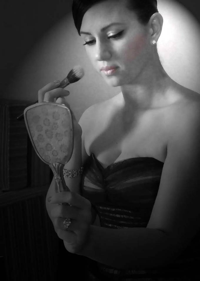
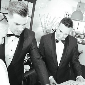
A local make up artist had me take photos for her new website and business cards. There were about 15 shots she ended up wanting to use for her website. The majority were black and white with selective color - which I'm not usually a fan of. Just wanted to post three of my favorites to have come critique :) The only thing that bothers me a bit - the first photo is a little soft.


1.
864845_medium.jpg


2.
864841_medium.jpg


3.
864840_medium.jpg
 
Of these three, #1 is my clear favorite. I like it's composition and the pose - you were able to get the "I'm a makeup artist" elements of the brush and mirror into the shot without obscuring any of the subject. Her position, while clearly posed, still manages to look relaxed (as compared with #2, in which she looks stiff). The lighting here is less harsh than in the other two. The only spot I'd take another look at is the back of her brush hand (the fingers holding the brush are borderline blown out, it's tough to be sure on my monitor here - but it's nothing you can't burn a bit if needed). I also like that you can actually see her eyes in this one. Oh, and I wouldn't worry at all about it being a bit soft in focus. For a makeup artist you want to convey the feeling of soft, smooth skin. Look at it from the point of view of a potential makeup artist client, not as a photographer.

I'm not as big a fan of #2. The composition seems a bit off to me - why leave that much space above her head yet just nick off her right elbow? The lighting is a bit too uneven; her brush fingers are again blown out, along with her cheekbone and clavicle, while her mirror hand is underexposed. I don't like that you can't see her eyes. I'm sure that she is elevating her face to the light (good!) while trying to keep looking in the mirror, but the effect I get is that the light was just too bright and she's squinting. I'm also not a fan of the background and how some areas are distracting (the blue rectangle coming out of her head, the bright white spots over her right shoulder).

I go back and forth on whether I like #3, or rather how much, because overall I do like it. Here too I wish I could see more of her eyes, it would have embellished her smile. I'm finding the lighting here just a bit unfortunate as well. The wall behind her seems to have a very interesting texture, so when my eye is drawn to the blown out spot just beside her face the lack of detail there is emphasized. And the angle of the lighting is creating an unfortunate shadow...with her hair up in the bun and the light catching her profile at that angle, I'm seeing more of a boy in the shadow (or, frankly, a monkey, but that might just be because I've been watching too much Escape to Chimp Eden lately). In general I might also add to watch out for the slouch, but in this case I like the relaxed feeling it adds to the pose.

Overall, nice work. Would you put up one or two of the selective color images (you've already disclaimed that it's not your preference, so hopefully you won't get reamed too hard for it)? I'm curious to see it from the MUA's preference. Except for the lipstick, which stands out, the rest of the makeup in these shots blends very nicely and looks natural. I'd assume that's the image you want to convey as an MUA rather than having it stand out and seem disjointed.
 
Thanks so much for the critique! I couldn't figure out what I didn't like about #2 but I think you hit the nail on the head..she does look stiff..a bit more unnatural. First photo was my favorite as well :)
Here is one of the selective color shots. She only wanted her lips/cheeks in the pink color.

1.
864827_medium.jpg
 
Hmmm... I'm not sure broad lighting on the first two was the better choice. And the ratio on the last two... I do like the shadow of the lash in the last one, but that nose shadow... man... tough call.

-Pete
 
Thanks so much for the critique! I couldn't figure out what I didn't like about #2 but I think you hit the nail on the head..she does look stiff..a bit more unnatural. First photo was my favorite as well :)
Here is one of the selective color shots. She only wanted her lips/cheeks in the pink color.

1.
864827_medium.jpg


Ahhhh!!! There ya go!

Short lighting scheme... less ratio... and (I can't BELIEVE I'm about to put this in writing) the selective coloring is a great choice for this product.

-Pete
 
Pete is correct, this is an appropriate use of selective coloring. Thanks for sharing that.

Obviously this is just one of the ~15 shots the client selected, and the editorial direction is determined by the two of you, but I have two quick recommendations for shots like this to enhance the "story". 1) I'd add a bit of pink to the tip of the brush as well, as that's how the makeup is being applied. 2) If you can, pick a perspective such as in photo #1, in which the viewer sees the cheek next to the brush. Certainly not taking anything away from these shots, and it may not be your client's preference, just something to think about.
 

Most reactions

Back
Top