Mareesa in Pink Dress

ElNico

TPF Noob!
Joined
Aug 10, 2017
Messages
109
Reaction score
8
Can others edit my Photos
Photos OK to edit
Form disclaimer - I'm a hobbyist. I do photography for fun, not to make money or make a career out of it. I've been told to mention this up front. It's also in my signature.

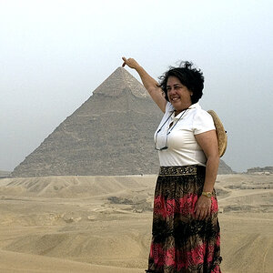
Two photos from a shoot last summer (the same day as the Red Riding Hood photos I posted a couple of weeks ago). Both were taken at f/3.2; shutter speed for #1 was 1/500s, #2 was 1/640s.

In additon to general C&C, I'm looking for insight into the following:

-I'd previously felt that #1 was the best photo from this set, owing the to the connection with the viewer and the model's expressive face; but on revisiting these sets recently I'm wondering if #2 might actually be better, for reasons that I find harder to pin down. Which do you think is better?

-I edited these on my previous laptop, which I think might have a dimmer screen than most other devices. Are they too bright?

Thanks! :)


#1 - #2 -
 
I'm no portrait photographer so my opinion may not hold a lot of weight but the first for me as she looks more relaxed and natural. In the second her pose looks a little awkward and contrived.
 
Well done, these are significantly better than the other shots. Your exposure is good here with detail kept in the darks of your model's hair, and the flag you've used has prevented the highlight problem you had in your other images. The posing is ok, though I think a little turn on her hips may have worked a bit better as she's very straight on.

She's very close to the background and I think that I'd have preferred to see the background straight and using a bit of symmetry in the first. I do wonder if choosing a background that contrasted more might have made the model stand out a little more and though I really like the way her dark hair frames her face and dark makeup makes here eyes pop the similar tones between the dress, her skin and the background may be worth experimenting with.

Seems to me like the highlights on her skin are a touch hot in the second, so there may be a little difference in your workflow which may be something to think about if you are producing some sets.

I think I prefer the first of the two, though it's pretty much a coin toss between the two shots for me.
 
Being a hobbyist doesn't give you much latitude for critiques so I will do so as if you are trying to make a buck or two. I don't see either image as anything but contrived. Go online and look at the thousands of modeling shots and find those that look the most natural and copy the ideas (I think Etsy has a ton of them). These are boudoir shots outside the bedroom against a block wall. If your intent is to show this girls ample bust, then do a boudoir shot and get right to the point. If not, then put her in a normal, relaxed pose in a normal uncluttered setting and practice your exposures, lighting, etc.
 
I do wonder if choosing a background that contrasted more might have made the model stand out a little more and though I really like the way her dark hair frames her face and dark makeup makes here eyes pop the similar tones between the dress, her skin and the background may be worth experimenting with.
Thinking about colors in retrospect, I guess I could have shot this outfit against a background of leaves, in the area I did the Red Riding Hood set in. I think that's the only way I could have gotten a more contrasting background in this location.

For tweaking it, I doubt I could alter her skin tone to contrast with the background without doing more harm than good by making it look unnatural (do you disagree?). I could try tinting the background; but I'd be tinting it green, which offhand seems like it wouldn't look good. What did you have in mind?

Seems to me like the highlights on her skin are a touch hot in the second, so there may be a little difference in your workflow which may be something to think about if you are producing some sets.
I increased the contrast by 20 and the exposure by 30 in the first, and by 30 and 50 respectively in the second. (Other adjustments were the same between them.) Contrast seems like the culprit for the highlights looking "hot," so I reduced that down to 20, but I also took the exposure down to 40 since I was already thinking this image was a bit bright. I altered the saturation by the same about, but didn't alter the shadow this time as I thought that also made it look a bit too "hot." Is this better?


Being a hobbyist doesn't give you much latitude for critiques so I will do so as if you are trying to make a buck or two.
You are the one who said that your critique would have been different if I'd said I was a hobbyist up front, so you're starting to sound a bit contrary to me.

I don't see either image as anything but contrived. Go online and look at the thousands of modeling shots and find those that look the most natural and copy the ideas (I think Etsy has a ton of them). These are boudoir shots outside the bedroom against a block wall. If your intent is to show this girls ample bust, then do a boudoir shot and get right to the point.
We did five different outfits in this session, and while all of them flattered her bust in one manner or another, I'd definitely say that this was the most risque; to which, the point of this set was basically to take advantage of the fact that she had a dress with a long zipper. One of the ideas we discussed for this shoot was a racer costume (example); and if we'd been going to do that, I might not have bothered with this dress, as I agree this is a bit contrived by comparison. However she felt that such an outfit would have been too hot for the time of year. So perhaps those circumstances allow these shots to make a little bit more sense.

If not, then put her in a normal, relaxed pose in a normal uncluttered setting and practice your exposures, lighting, etc.
We didn't spend much time on this outfit, as again the point of using it was basically to make use of the long zipper, and there were other concepts I wanted to devote time to (and even then we didn't end up getting the chance to do everything). I don't know if I'm going to eventually post photos from every outfit that we did this day; but I will say that the reason why I posted these photos at this time is that I already had them edited, and unlike some of the other outfits - particularly the first one we did, which we spent the most time on and has BY FAR the greatest variety of poses - I didn't think there was much chance of my finding "better" poses on further inspection of the unedited ones.

In other words, I did do more straightforward poses that day, and I haven't shown you those because I'm not finished editing those yet, while I figured I was finished with these.
 
Last edited:
Again, same response...I don't see sexy, nor anything particularly interesting about these poses...while some may like this kind of shooting,, I find it terribly contrived and unnatural...just me, I guess.
 
I prefer pose number 2. I think your re-work of it is good.
 
I find the first shot more engaging to the viewer ... the second one does not make "sense" why she has twisted her arms to view something out of the view.
 
Yeah, that's better. As for changing the background in post, IME it's very seldom done well enough that it works so I'd leave it as is. I'm not fully sure why it doesn't quite work for me. May just a bit of seperation from the background may work
 

Most reactions

Back
Top