
minicoop1985
Been spending a lot of time on here!
- Joined
- Sep 3, 2013
- Messages
- 5,520
- Reaction score
- 1,865
- Location
- Appleton, WI
- Can others edit my Photos
- Photos OK to edit
First, the setup:
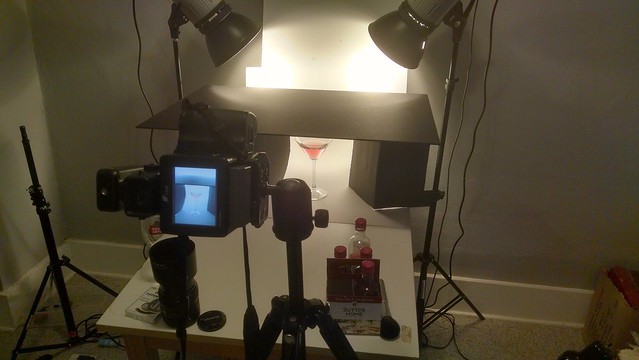 2016-02-24_02-29-19 by Michael Long, on Flickr
And now the shot:
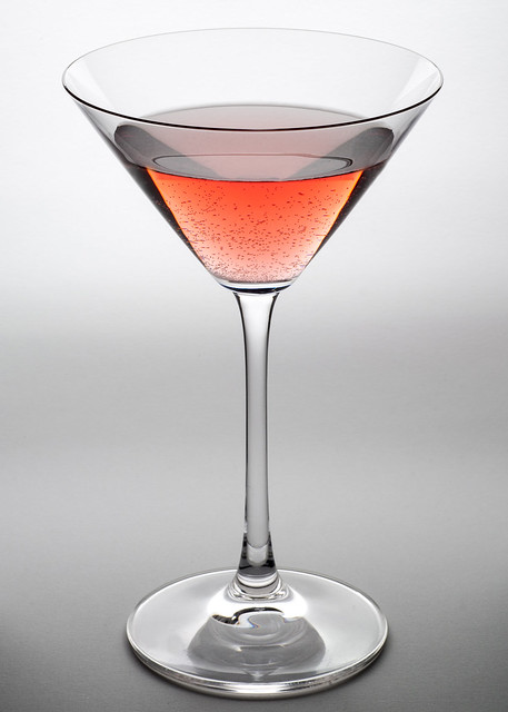 Glass lighting experiment: Cosmopolitan 2 by Michael Long, on Flickr
Comments/critique welcome and appreciated. Oh, and I cleaned my sensor.
2016-02-24_02-29-19 by Michael Long, on FlickrAnd now the shot:
Glass lighting experiment: Cosmopolitan 2 by Michael Long, on FlickrComments/critique welcome and appreciated. Oh, and I cleaned my sensor.
Last edited:


![[No title]](/data/xfmg/thumbnail/37/37534-e0f67d1d14bd79cca15937359f0e4c94.jpg?1619738132)
![[No title]](/data/xfmg/thumbnail/39/39657-59afb9b38e439b33906e81e4952470ac.jpg?1619739154)
![[No title]](/data/xfmg/thumbnail/42/42026-4f14b406e4eb9c886f454721fb021fba.jpg?1619739982)
![[No title]](/data/xfmg/thumbnail/37/37170-3e18af574ed51cce5bdf99af9d3cab40.jpg?1619737908)