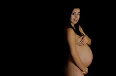
Okay... and? To be honest, given that this is posted in the Professional Gallery, I find it somewhat lacking. The subject's positioning in the frame doesn't make sense to me, the lighting is (IMO) less than flattering, and there's an upleasant highlight caused by her braces. The highlights seem small and rather too low indicating a key light that was either too far away or used with too small a modifier, and too low relative to the subject. Her pose also seems rather awkward and forced.
My suggestion would be either a very large 60 - 70" modifier to provide a very soft, gentle light, or a tight, gridded light on an angle from upper camera left. This isn't a bad image by any stretch, but there is significant room for improvement.


![[No title]](/data/xfmg/thumbnail/41/41756-e54235f9fba04c8380cd991845bb84b1.jpg?1734176055)


![[No title]](/data/xfmg/thumbnail/31/31751-fb2f68cca32f9eec468dbde7d649840f.jpg?1734160471)
![[No title]](/data/xfmg/thumbnail/31/31749-6cf0f99d6bdedf47f7387c5b943fb717.jpg?1734160468)


