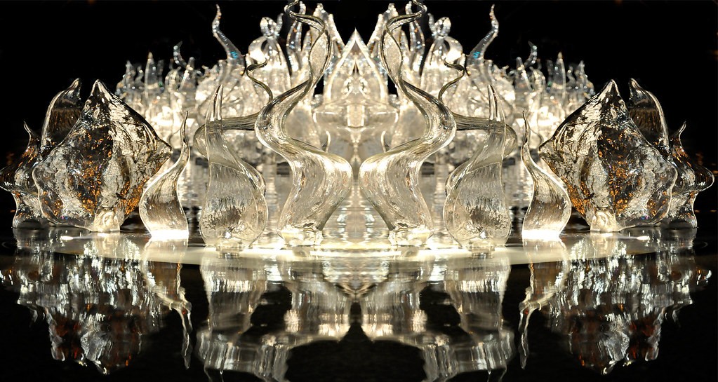
I prefer the first photo over the second one, but I think that in both shots you have cropped far too closely to the top of the glass sculptures. In the first photo, you allotted ample room for the reflection at the bottom, but there's a lot of visual tension created by having the glass touching the top of the frame.
In a formal,balanced composition like this, it's considered normal to allow a little bit more top space than one would allow in a regular,everyday photo.
A little bit deeper depth of field would also probably improve the impact a bit. The farthest objects are starting to slip outside the band of sharp focus, and that stops us from being able to enjoy the visual beauty of that curvy glass.


![[No title]](/data/xfmg/thumbnail/32/32176-48b4ba2fc0e35afa267c5882154e7620.jpg?1734161047)

![[No title]](/data/xfmg/thumbnail/42/42484-fe2beb05d743deaf21681664722538d4.jpg?1734177008)


![[No title]](/data/xfmg/thumbnail/32/32175-dfc7c053c145a53c7f2585ca44f122d4.jpg?1734161047)

