What's new

Misty Graveyard

theraven

No longer a newbie, moving up!
Joined
Oct 16, 2012
Messages
677
Reaction score
102
Location
Stoke on Trent, Staffordshire, UK
Can others edit my Photos
Photos OK to edit
I took this before I started shooting in RAW, so this is about the best I could get it, that said, I do quite like this picture. Just wondering what everyone else thinks of it? I like how its slightly unfocused. It's not a fantastic shot, but as I say, for some reason I just like it!
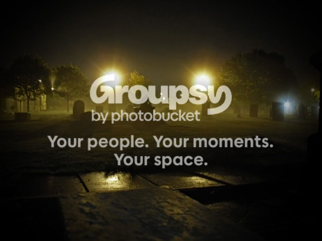
DSCF9288.jpg
 
Not bad, but I think there is too much "unknown stuff" in the foreground. I think I would have moved in a bit more and focussed on the head stones a bit more. I also might have tried to get the shot without the lights, but maybe with their lighting up the scene - maybe some fill flash - don't know, but there is something mssing for me at least. My 0.02¢ FWIW.

WesternGuy
 
The sidewalk in the foreground is really distracting especially since it tends to be the most in focus. I don't mind the lights though. The vignette is a way too dark and I would guess your blacks are most likely clipped in all of those areas.
 
Thank you, as said this is before I had a camera that shot RAW so I couldn't pull the details back, they have been lost forever. Although I could still crop the foreground out! Thanks guys!
 
Well as said, JPEG sucks, so here I've cropped it and tried to lighten it... Is that better?

DSCF9288copy_zps307d1799.jpg
 
The first one illuminates the graveyard better, but the plaques distract. Cool misty atmosphere.

The edit accentuates the zombie coming out of the grave. Or is it a monkey sitting on top of a tombstone??
 
Just my opinion:

The lights themselves are way too bright, way too big and way too distracting and add nothing positive to the image. The color scheme is wrong for a graveyard shot, especially a misty one (it's warm and should be cool). There's too much extraneous stuff that's not "graveyard", like the aforementioned sidewalk. The focus isn't where it should be.

Here's a quickie shot at distilling it down with a severe crop, temperature adjustment and sharpening:

graveyardcrop.PNG


I put the border around it because it's too difficult to see on it's own against the bright white background of the forum page.
 
Nice Buckster
 
The crop edit by Buckster is too severe. I like seeing the trees in the landscape.

The lights do distract and they are bright. It might have been better if there were a series of receding lights in the mist instead of two full head-on blinding headlights.

Oh--was your friend eating a midnight snack on top of the tombstone? :mrgreen:
 

Create an account or login to comment

You must be a member in order to leave a comment

Create account

Create an account on our community. It's easy!

Log in

Already have an account? Log in here.

Back
Top Bottom