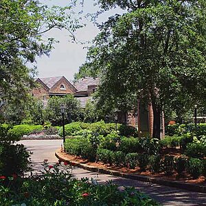
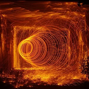
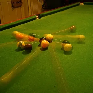
Hey vis... Nice series. I liked 1, 8 was really creative and I thought 9 was just amazing. One thing bothering me though is that they almost ALL have a yellowish cast to them... I can't recall... you may be the guy who likes to do this deliberately... if so, ignore me... if not... stop it!

EDIT: Actually the yellow cast in 9 is a cool effect with the yellow truck.
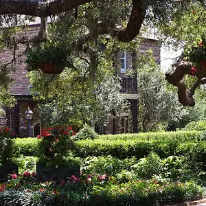
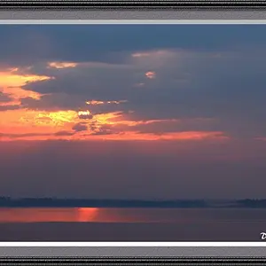
I was curious about your comments regarding a yellowish cast. I downloaded images #1 and #3 as there looked to be some parts which I thought I could pinpoint to see if they were neutral white.
I opened them in PS and placed a color sampler mark on areas of white, then looked in the info palette.
Image #1, having chosen a spot of white in the middle clouds, toward the right of the image shows RGB values of 153, 168, and 165 with corresponding CMYK values of 43%, 26%, 33%, and 0%. If the white were truly neutral, the RGB values would be equal to one another. While that white in the cloud isn't neutral (what toward sunset would be?) the info palette doesn't seem to suggest that there is a cast toward yellow. Really low Blue of the RGB would suggest excessive yellow, as would an excessively high Y value on the CMYK side.
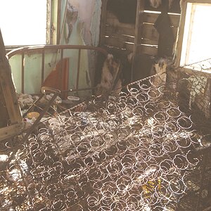
Image #3, having marked the white trim of the window within the door gives info palette values of 233, 237, and 246 for RGB, and 7%, 4%, 1%, 0% for CMYK. Here the B value is highest, denoting lowest yellow, which seems to be corroborated by the 1% of the Y on the CMYK side. The white window trim seems to be pretty close to neutral.
I didn't try with the other images as I wasn't seeing an easy area to pick that should be neutral.
Hope this doesn't confuse the issue too much.
Perhaps someone with more computer/monitor savvy could address whether differences in monitors could create differences in what the info palette shows? My knowledge in that area is quite limited, and I had thought that monitors wouldn't affect the info palette, which is why that technique is recommended for analysing colour.
All too often differences in monitors and differences in ambient light can affect our human perception of colour, and I'm hoping that the info palette method of analysing colour reduces those factors.



![[No title]](/data/xfmg/thumbnail/32/32177-3a3d923fa1584c6ef7d6602aaa24fbc6.jpg?1734161047)
![[No title]](/data/xfmg/thumbnail/32/32935-452d7573a35ee2f5d0b9ad6463de680e.jpg?1734162731)

![[No title]](/data/xfmg/thumbnail/32/32173-af05ea40d00ae9cd79a01007df914b5f.jpg?1734161047)