What's new

Miya 2

xc222

No longer a newbie, moving up!
Joined
Sep 12, 2007
Messages
191
Reaction score
105
Location
Hong Kong
Can others edit my Photos
Photos NOT OK to edit
2222.webp

010101.webp
 
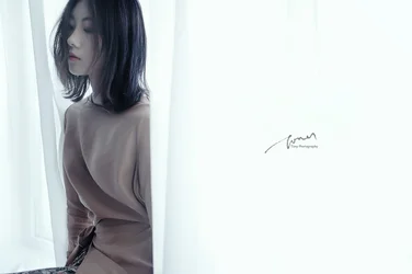
I love the vision, lighting and toning a lot. The first shot is great and I wouldn't change a thing.

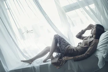
I'm undecided on whether I like the full body shot though. The tilted angle is jarring, especially in contrast to the soft and serene mood of the shot. I understand that artistic license/ intention could be the reason behind the decision to frame the shot with such a dramatic tilt, but my first impression is that everything in the frame is going to slide down and off of the lower left corner of the shot, and I think the effect is a little too much because for me it becomes uncomfortable to look at.

 
Last edited:
I'm going to oppose everything Dan said. The first shot is.... mehhh to me. The lighting is nice, but it feels just too tight. The second, I really like. I'm undecided on the tilt. I like it, but I'm not sure if I wouldn't like it even better were it leveled.
 
I love the vision, lighting and toning a lot. The first shot is great and I wouldn't change a thing.

I'm undecided on whether I like the full body shot though. The tilted angle is jarring, especially in contrast to the soft and serene mood of the shot. I understand that artistic license/ intention could be the reason behind the decision to frame the shot with such a dramatic tilt, but my first impression is that everything in the frame is going to slide down and off of the lower left corner of the shot, and I think the effect is a little too much because for me it becomes uncomfortable to look at.
Thank you for kind comments on my pictures.
 
I'm going to oppose everything Dan said. The first shot is.... mehhh to me. The lighting is nice, but it feels just too tight. The second, I really like. I'm undecided on the tilt. I like it, but I'm not sure if I wouldn't like it even better were it leveled.
Thank you for kind comments on my pictures.
 
I really like the diffuse light and muted tones, but as others have said, the crop in #1 is very tight and the angle in #2 is too much for me.
 
De gustibus non est disputandum . but there are definite sharpening haloes in the second shot particularly obvious around her feet and legs that give an almost radioactive look to her.
The haloes are less obvious on her torso, arms and curtains but still there.
I think that if her right foot had been more extended, it would have complemented her left foot position better.

upload_2019-10-9_10-10-59.webp
 

Create an account or login to comment

You must be a member in order to leave a comment

Create account

Create an account on our community. It's easy!

Log in

Already have an account? Log in here.

New Topics

Back
Top Bottom