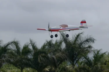
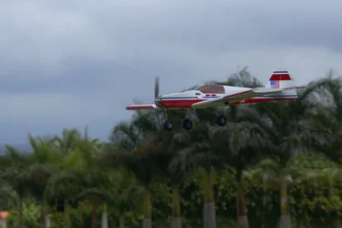
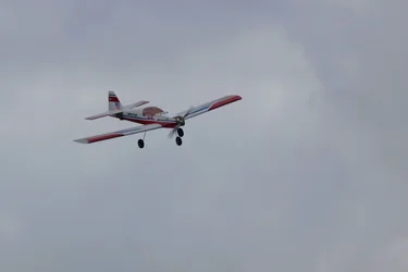
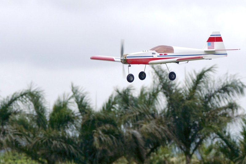
I think #3 has the most potential. In #2 the plane is "hidden" by the tree tops (it doesn't stand out as the subject of the picture at all), and #1 has the trees competing with the plane for attention. (It doesn't help that the one frond in #1 seems to be holding the plane in the air.) I can't help thinking #3 is under-exposed, though. The plane looks more gray-and-red, where #2 shows it to be more bright red and white.
I also think you could crop #3 to improve the location of the plane in the picture. Right now it seems fairly centered top-to-bottom; it would probably make the picture more dynamic if you moved the plane up in the image a bit. (I'm not so worried about the plane taking up only a small portion of the image, though. You could zoom in and have it fill the image, in which case your making a point about the plane itself. Or you could leave it fairly small in the image, and make a point about "the insignificance of man-made objects in the natural world" - or whatever other "noble" concept strikes your fancy.)





![[No title]](/data/xfmg/thumbnail/32/32939-0b23ff8a791c06732705126fb26845ea.jpg?1734162753)
![[No title]](/data/xfmg/thumbnail/36/36397-b2aca1c8ba1009853020154d6dd4b0e5.jpg?1734168782)

![[No title]](/data/xfmg/thumbnail/32/32940-461c74a1d3ad8d2862e02a293727c72a.jpg?1734162758)

![[No title]](/data/xfmg/thumbnail/37/37095-648a4e65f10e6fdeeb231be5ed8c3152.jpg?1734169827)