What's new

Model shoot. Any C&C appreciated!

darioso

TPF Noob!
Joined
Jan 14, 2014
Messages
13
Reaction score
4
Location
canada
Can others edit my Photos
Photos OK to edit
Hello everyone,
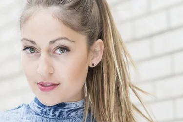
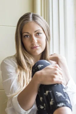
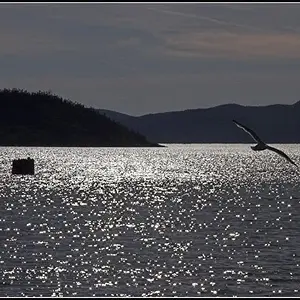
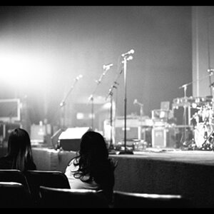
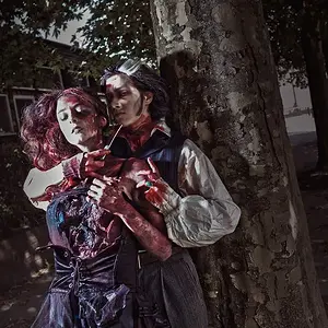
I had a photoshoot with a model and would appreciate any feedback. The images are not full sized as I'm uploading FB pictures through iphone, sorry! A reflector was used for the headshots.

 

Attachments

  • $image-1489841037.webp
    $image-1489841037.webp
    46.3 KB · Views: 165
  • $image-896038779.webp
    $image-896038779.webp
    72.6 KB · Views: 183
  • $image-1080060677.webp
    $image-1080060677.webp
    44.4 KB · Views: 171
  • $image-1917901840.webp
    $image-1917901840.webp
    45.7 KB · Views: 174
  • $image-1871677982.webp
    $image-1871677982.webp
    77.1 KB · Views: 179
It's better than everything I ever done in portraits but there some things I don't like:
1. Odd crop. The model takes to little place in the picture and her finger are cutted off.
2,3,5 - I like them best and have nothing to say.
4. I like her face expression but the foreground draws away my attention from the face.
 
# 2 is pretty groovesome photography - good background and pose.
 
The color on the whole set feels off... Slightly desaturated and a slight green tint that doesn't feel right.

Your choice in composition or cropping create images that feel too tight, constrained and not very compelling. Consider backing off, getting more in the frame, especially in 3 and 4.

You did an acceptable job with the reflector, but consider backing it off a bit so the effect is more subtle. She's pretty hot and washed out on her face in 3 and 5. A lot of this could be improved in post, by taking down the highlights with an adjustment brush and increasing local contrast in the highs and midtones.

Keep posting! You'll get better if you listen...
 
Not a fan of the reflector results here :/
 
#'s 1 & 2 is where you should have used the reflector to get more light under the brim of the hat.
#1 Distracting background. Maybe more blur on it, have the model turn toward that direction, or recompose to eliminate it.
#3 Should have been framed vertically.
#4 The composition centers the model's face, but the frame has missed it a little to the right.
#5 An admirable composition with which to showcase your watermark, but not so much for the model. IF you were going to frame for the model, frame a little wider and a little lower.
 
Thank you a lot everyone!
I appreciate your valuable feedback! It's amazing to hear from people like you with great field experience!

David
 

Create an account or login to comment

You must be a member in order to leave a comment

Create account

Create an account on our community. It's easy!

Log in

Already have an account? Log in here.

Back
Top Bottom