What's new

Model with a new Hat

oldmacman

TPF Noob!
Joined
Jul 16, 2010
Messages
1,597
Reaction score
70
Location
Southern Ontario
Can others edit my Photos
Photos OK to edit
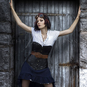
I worked with this model last we and we got along so well, we did another session today. She reminds me of Audrey Hepburn with this hat on. C&C welcome.

1.
MarkanaHat-1.jpg


2.
MarkanaHat-2.jpg


3.
MarkanaHat-3.jpg


4.
MarkanaHat-4.jpg
 
Looks like great location and beautiful model, wish the light was diffused in some so you could not see the splotchy light. Hand shadow on the 3rd images is distracting or it would have been a great image. I like the series, but feel we need to nail the lighting.
-
Shoot well and thanks for sharing, Joe
 
Looks like great location and beautiful model, wish the light was diffused in some so you could not see the splotchy light. Hand shadow on the 3rd images is distracting or it would have been a great image. I like the series, but feel we need to nail the lighting.
-
Shoot well and thanks for sharing, Joe

Thanks for commenting. Your perspective is always appreciated.
 
perfect background, perfect model with perfect dress, & perfect quality of photos.
 
Wow! :thumbup:

I really live #2 and 4.
 
nice outfitt and hat.. the light is way to flat, and there is not enough seperation between the model and the background. IMO :)
 
nice outfitt and hat.. the light is way to flat, and there is not enough seperation between the model and the background. IMO :)

Hope you can help me out, because I am not sure what you mean. Let me know how you would change the lighting ratio. I've included a 100% crop of one of the images as detail and tones are often lost when large images are compressed in size and quality for the web. Also not sure what you mean about separation. From what I see, the model does not blend with the background area. With the simplicity of the dress against a textured rock wall or a blue sky I am not sure what you mean.

Markana100.jpg
 
if you have added just 1 stop more light to the model vs the wall baground you would have better seperation, or have her further away from the wall, using less dof. There is to much going on behind making her compete to be the main subject. Just simple tricks :)
 
Number one is just amazing! Good job, I think I know why you put this one at the top as its so good its painful to look at! haha!
 
Besides some minor lighting issues I would like to address your choice of scenery. The scene does not feel fitting for this outfit. Her outfit seems very urban and glamorous but you have her in a setting that looks very country.
 
Besides some minor lighting issues I would like to address your choice of scenery. The scene does not feel fitting for this outfit. Her outfit seems very urban and glamorous but you have her in a setting that looks very country.

The concept was to contrast the setting with the outfit... juxtaposition of elements. I guess it's a matter of personal taste on whether it works or not. Thanks for taking the time to look and comment... much appreciated.
 

Create an account or login to comment

You must be a member in order to leave a comment

Create account

Create an account on our community. It's easy!

Log in

Already have an account? Log in here.

New Topics

Back
Top Bottom