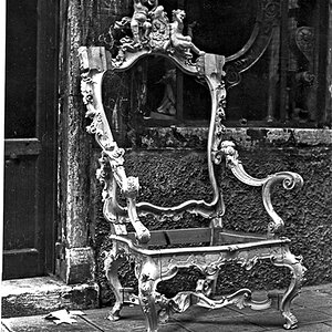
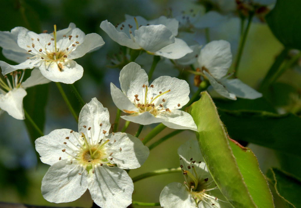
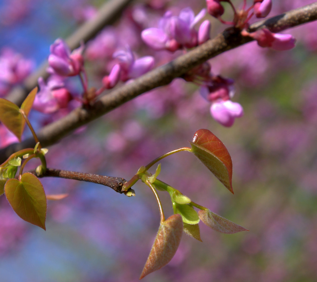
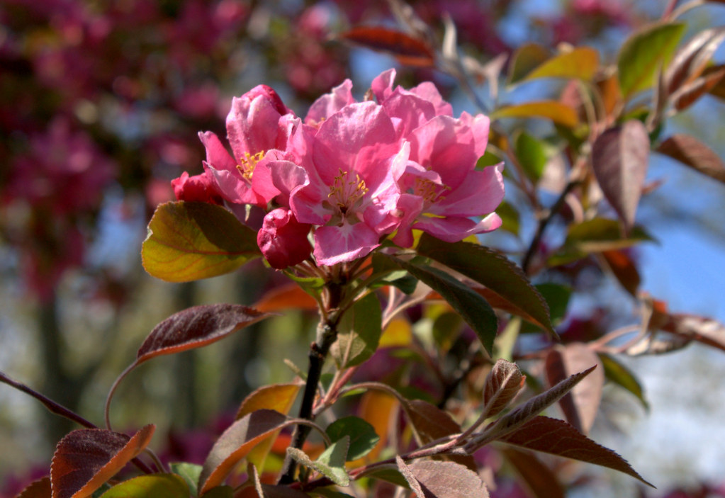
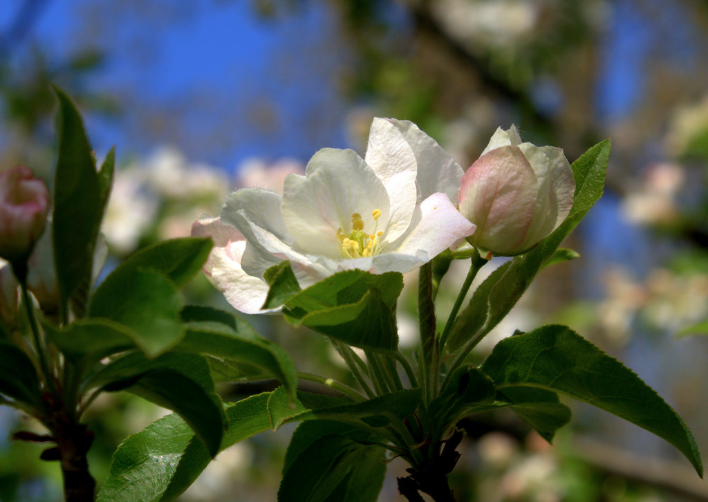
I like #4 and #5 but they need a closer crop imo. Too much in the background on them.. it's like I want to zoom in on the flowers.
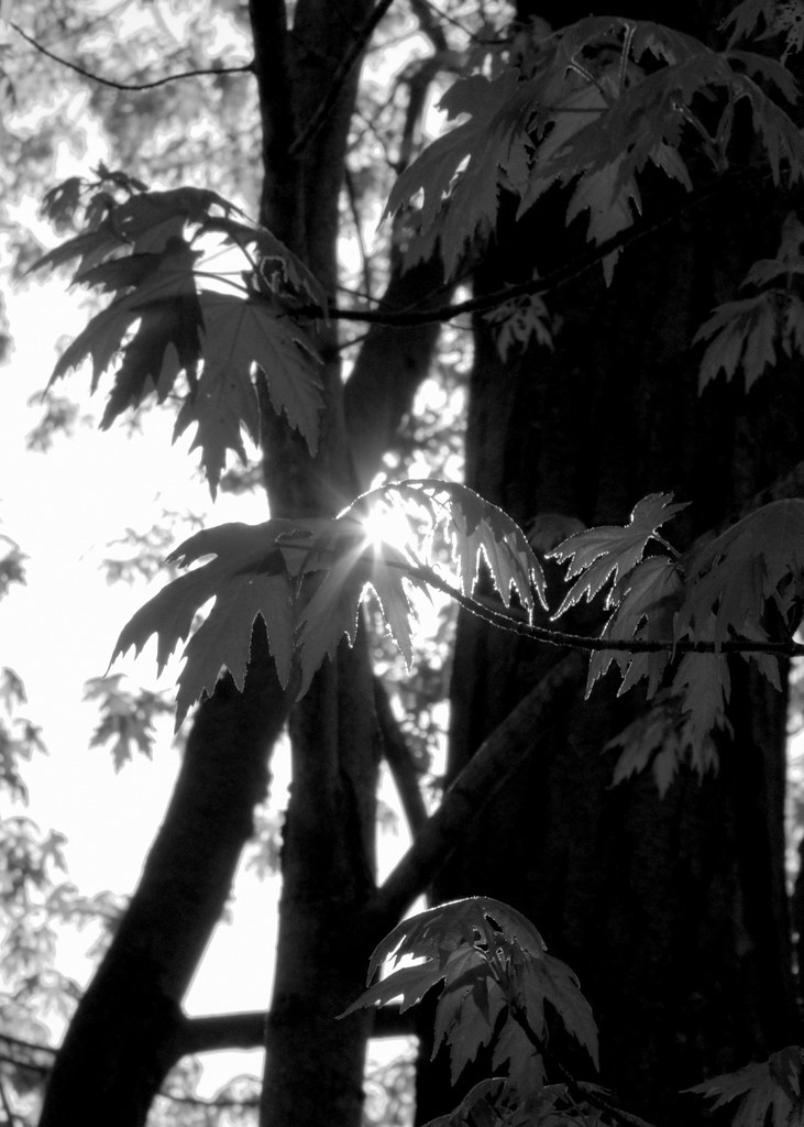
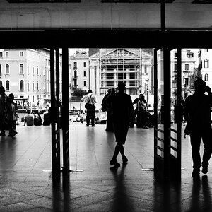
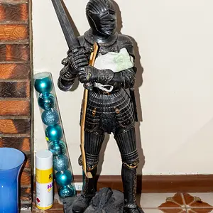
In #3 I really like the contrasts of light and dark. I think this works well in black and white. The little bit of light shining through on the far right side, I'd edit that out.. just to keep the photo polarized, so to speak.
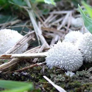
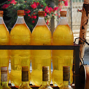
The first two aren't really doing it for me, composition-wise. I will say that you did a good job on #1 in keeping the whites from blowing out. #2 is exposed well and the colors are great - I'm not sure about the square crop though..
Good stuff, and I'm sick of flowers - but good job






![[No title]](/data/xfmg/thumbnail/37/37170-3e18af574ed51cce5bdf99af9d3cab40.jpg?1734169892)


![[No title]](/data/xfmg/thumbnail/35/35872-12704b8c65e1c009d7089ccba367abb6.jpg?1734167602)