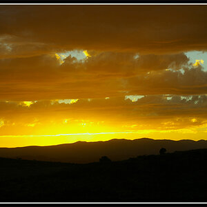
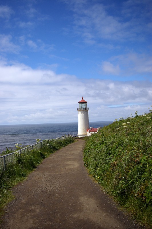
The exposure appears to be correct. Your horizons are not level though. I thnk the shot of th lighthouse would be better if you croped in closer on the lighthouse, there is too much space void of anything that adds to the photo around the lighthouse.
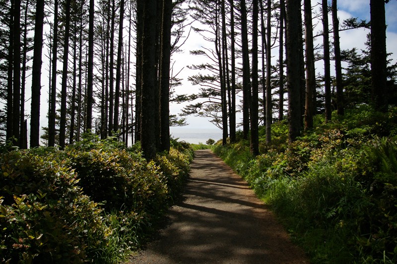
The last one is my favorite, very good composition!
1.The light house could have been a bit closer if not more. If there were some more pretty or un-normal cloud formations then at the distance you were at would have been good, but since the main focus is the light house then I would have steer a bit closer. But it is still a very good looking picture.
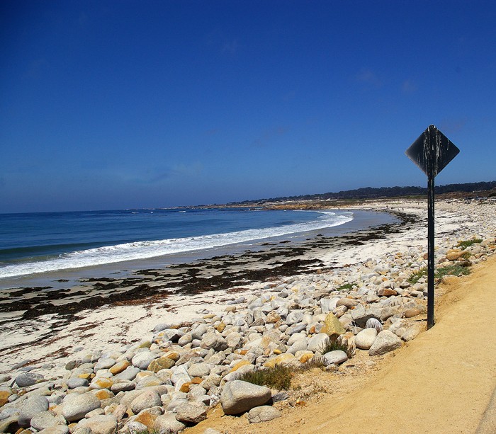
2. You might have wanted to crop down the top and bottom a bit more, kinda left a bit of dead space.
3. If your goal for this picture was to show the steepness of the ledge nicely done. How steep is that by the way?
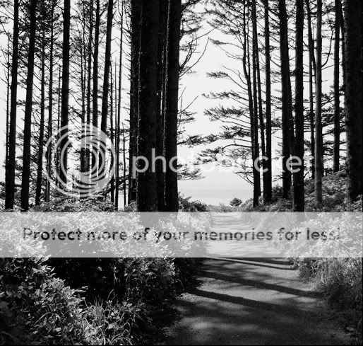
4.Like is I said above this one is my favorite, don't have much to say about it.
It was pretty steep. Actually the reason I took that pic is because of the green/red vegetation on the steep cliff. I thought it made a nice contrast to the blue water.
1. Straightened the horizon so the sea wouldn't drain out of the left hand side of the picture. (not quite perfect I don't think, but close)
2. Cropped a bit to add a bit of visual interest... took the horizon off-center, moved the lighthouse into a "rule of thirds"ish location.
3. Popped up the contrast a bit (+15)
4. Sharpened it a bit.


")


![[No title]](/data/xfmg/thumbnail/39/39490-b2e64c58554ef92efe2474950d27753d.jpg?1619739050)