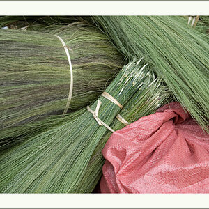
Nice shots. I like #3 a lot. My only problem with it is that the towel bundle and bright floor seem to dominate the picture. I'd try cropping out some of the floor, maybe a square crop?
Yes, much better. I actually like more negative space on top...for me, don't know why, but it makes it look more professional and less snap-shot like. One would think it would be the opposite, but it's not at least for me. I like the idea of using just a darker color rather than a black. You still get the contrast without it seeming like nothing is there. I think these are better (I can see the bow better zoomed out for some reason).
I hope you don't mind me giving your picture an edit. I really like the shot put couldn't quite figure how to make it better. Once I commented I figured i had to try.
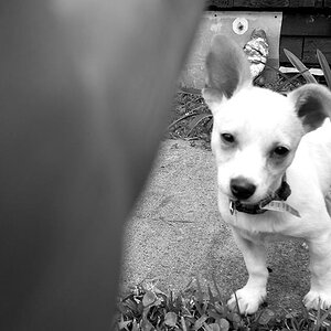
I made a change to the white balance to warm him up a bit (more red) while taking some of the yellow out of the wood. Fussed with curves a bit trying to emphasize the baby. Square crop.
I like all 3 images, I do prefer Desi's crop. My preference is make the baby the subject and do close in shots so I would even crop in closer with the basket shot and add a little noise to taste for a more authentic look maybe if you wanted to try for a 70's aged feel. Good shots:thumbup:.

")


![[No title]](/data/xfmg/thumbnail/33/33343-857a08c1327857172779bfe49f06f638.jpg?1619735911)