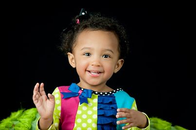
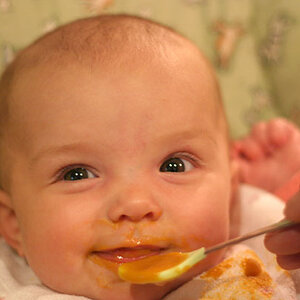
Yes, the lighting is a bit "flat"...in the first of the larger images,see how on her dimples, there is a little shadow that is almost perfectly equal, on each dimple??? That's from the light sources on the left side of her, and on the right side of her...that casts identical shadows, and ONLY in areas where there is a crease or skin fold...on each side of her nose there is NO shadow...this is an almost perfect 1:1, or ratio-less lighting scenario. It's bright, and light,k and there's a lot of "eye-sparkle" due to the two sources, but the depth, the dimensionality of the scene is totally lost. It looks "flat". Luckily, she's adorable, and there are bright, vivid colors that mitigate the effects of the flat lighting, so those two things help.
The second large color image has a slight,slight bit darker light on the right side of her face, but it still qualifies as flat, low-ratio lighting. But again, the colors and cuteness kind of subdue the lighting scheme.
I'd be tempted to use just ONE umbrella, and take a second light and fire it at the background, OR take the one,large umbrella and literally AIM IT AT THE BACKDROP about 3/4 of the way, and then skim the other 25% of the light "in front of her face"..."feathering" the light across the face, to give more definition and at the same time, throwing much more light on the backdrop, which would give an in-camera gradient effect on the dark backdrop, which would make her hair separate and would literally bring the "three-dimensional" look fully to the forefront.