What's new

More of Kristen

frommrstomommy

Been spending a lot of time on here!
Joined
Feb 3, 2010
Messages
2,345
Reaction score
1,003
Location
florida
Can others edit my Photos
Photos OK to edit
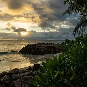
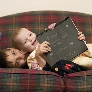
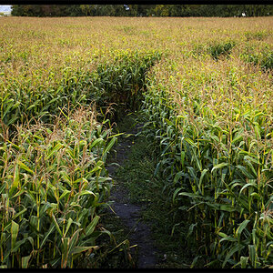
OMG...Helen of Troy..a thousand ships...

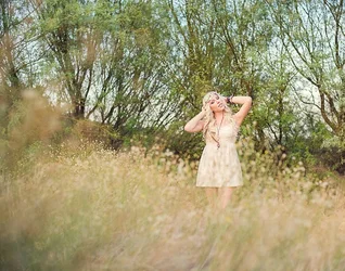
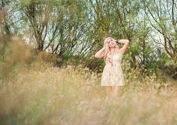
I like the voyeuristic look of the last one, but think it'd look better to crop off those yellow sticks, and leave her on the right 1/3 intersection: LOVE the wild, natural background and foreground objects used to force the eye to her. The yellowish sticks (saplings?) bother me. Numbers 1,5,7 are also just wonderful looks at this lovely woman.
 
It's really neat watching your progression. Nice job!
 
I cropped out the sticks or saplings, to see what it looked like.

$Crop n clone.webp

and while it looks okay at this roughly 8x10 aspect ratio, I thought it felt just a bit too static, so I cropped it more at the top, and a little at the bottom, and came up with something a little bit closer to the 3:2 aspect ratio your camera shoots in natively. I dunno...better? Just different? That's probably up to the viewer to decide.

$Crop n clone apprx 3 to 2 ratio.webp
 
I definitely like it better without the sticks. I kind of liked the wide though.. I wonder if I could just clone them out? I'll have to play with it!

Thanks both :)
 
I definitely like it better without the sticks. I kind of liked the wide though.. I wonder if I could just clone them out? I'll have to play with it!

Thanks both :)


I know what you mean: the wide aspect original has that big tree in the back right, which really anchors the background treeline with its size, shape, dominance, and the shadows that it casts. Light advances, dark recedes; the dark shadow is PERFECT for the right hand side background!!! But....the sticks "advance" strongly, very,very strongly because they are seen in front of the deepest, darkest shadow in the entire scene. The easiest way to draw attention to something is to put (or to capture via timing) a light subject in front of a dark background tone or color and BOOM! the eye goes immediately to that light/dark overlap area, over and over. I just wanted to show how removing the sticks changes the dynamic. Light in front of dark seems to be more powerful than dark in front of light, in most cases.

But yeah, sure...the sticks can be cloned out, just zoom in big and work carefully. My feeling is that in the original capture, she's located a bit too strongly centrally, and it just doesn't feel quite 110 percent balanced. But I really do like the foreground brush on the lower left corner, and the "peering past stuff" to see the subject, which is a technique used a lot in Asia, where foreground bokeh is pretty well-accepted. I might burn that lower left corner down a bit more--creating another dark/light overlap and further reinforcing the feeling of "peering past" foreground stuff to see the woman in the natural clutter and chaos of the real world. I love that location!!!!!!! So messy, so Romantic-era ideal...not all manicured, but untamed, overgrown, abundant, fertile.
 
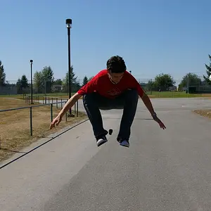
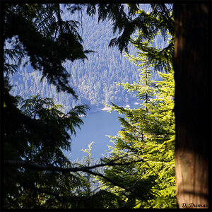
These are all wonderful, but I really love #2 and #3!!!
For me I just really love the exposure, it is really dead on!:)
 

Create an account or login to comment

You must be a member in order to leave a comment

Create account

Create an account on our community. It's easy!

Log in

Already have an account? Log in here.

Back
Top Bottom