What's new

More Torri

Pallycow

TPF Noob!
Joined
Nov 16, 2012
Messages
1,697
Reaction score
520
Location
United States
Can others edit my Photos
Photos OK to edit
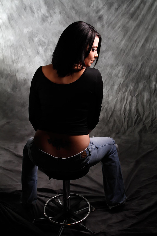
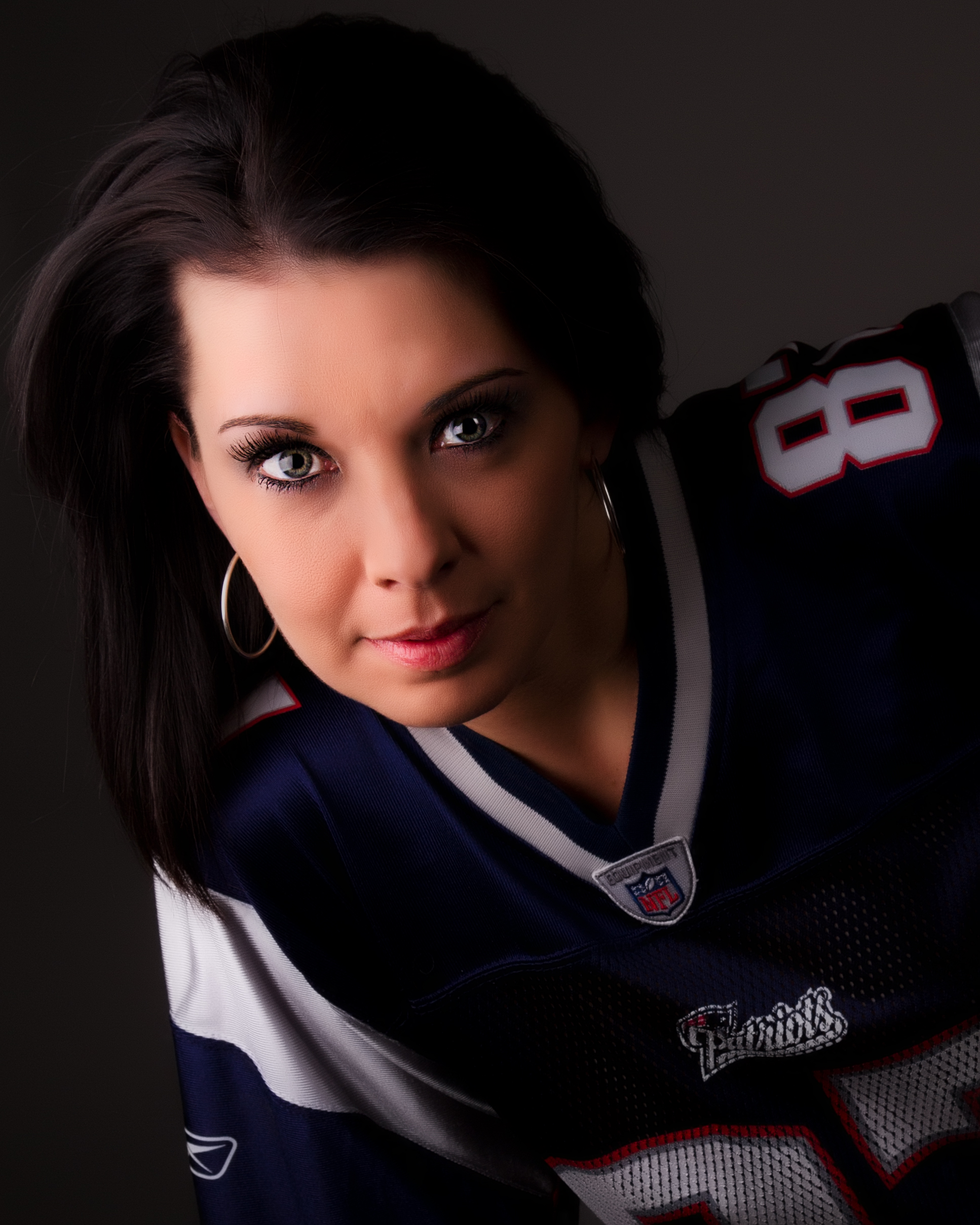
Here's another I finished up. I wanted to go for the dark low key sort of thing...is it too dark or good as is? I guess it's really more of a taste thing.
8421293726_0dc8727f83_o.jpg
 
Nice image; I guess the answer to the exposure question really relates to the use of the image; for me, I'd like to see the hot side just a little darker and the shadow side just a little brighter, but regardless, nice shot!
 
look too plastic and oversharpened IMO.


I didn't sharpen it. After skin smoothing I masked back in the original eyes...but didn't sharpen them.

in small version it looks like she has the ps mask on, but if you look at large version, you can see a lot of texture in her skin still....so it's kind of illusiony lol, is that a word? is now.

Might be a tad much, but she has a lot of deep pores on her face....so it's kinda needed, with this processing, the contrast makes them stand out more than they really are.
 
Nice image; I guess the answer to the exposure question really relates to the use of the image; for me, I'd like to see the hot side just a little darker and the shadow side just a little brighter, but regardless, nice shot!

I might play with that later and see how it looks, thanks.
 
Here's a few more I finished up tonight.


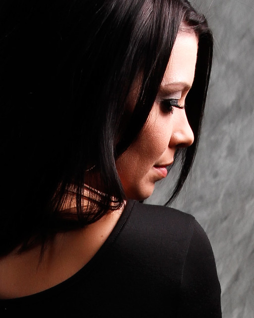
8421383675_604d2bbe04_c.jpg


8422476460_b0b2b8df58_z.jpg


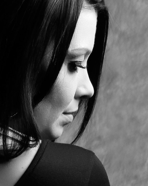
Was not sure I liked all that neg space behind her head in the shot above, so I cropped in more and converted to B&W. Probly just a taste thing, but I really like this one.


8421380943_0780c7a91c_z.jpg
 
really like the last shot cropped (color version)
 
I wanted to go for the dark low key sort of thing...is it too dark or good as is?

Then you would want to eleminate the jersey all together and replace it with a top that does not exceed middle grey. The whites are competing with your subject.
 
Did you do anything to her eyes in the first shot? Dodge them a little maybe? There seems to be a mismatch between the shadows and her eye on the camera right side of her face. I agree with tirediron about the exposure: I would like to see the hot side a smidge darker and the dark side just a smidge brighter.
 
Yeah I dodged that eye too much, it stands out more than it should.
 

Create an account or login to comment

You must be a member in order to leave a comment

Create account

Create an account on our community. It's easy!

Log in

Already have an account? Log in here.

New Topics

Back
Top Bottom