What's new

Motorbike Photoshoot - Please Critique

BlakKrauStudios

TPF Noob!
Joined
May 16, 2012
Messages
9
Reaction score
0
Location
Hampton, VA
Can others edit my Photos
Photos NOT OK to edit
I'll be doing a few shoots for some friends and their motorbikes over the next couple of months, and it never hurts to practice. So I did this shoot in the hopes of figuring out what works and what doesn't, before someone actually pays me for a product. ;)

1
BKS_7311.png


2
BKS_7157.png


3
BKS_7153.png


4
BKS_7149.png


5
BKS_7130.png


6
BKS_7142.png


I tried to get creative with a few, so but hopefully I didn't get too crazy with it.
 
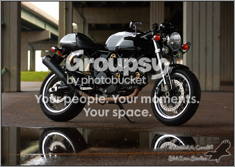
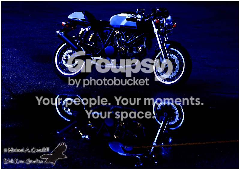
#1 is fine, in spite of a distracting background. The reflection is nice, but too bad it is not polished marble instead of just a puddle.
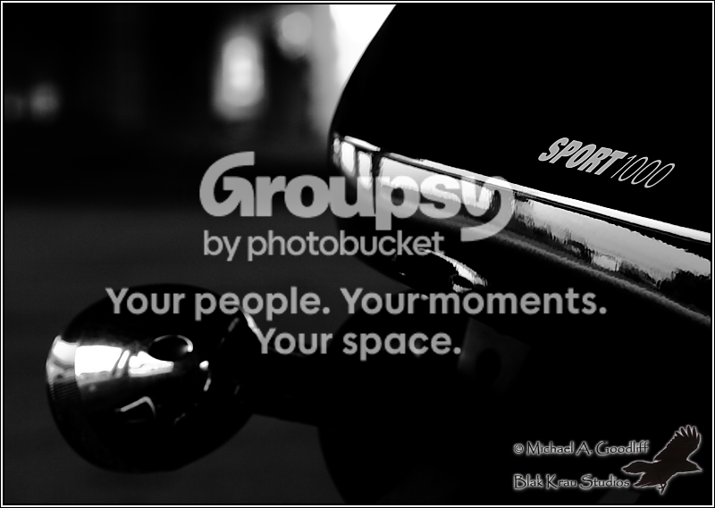
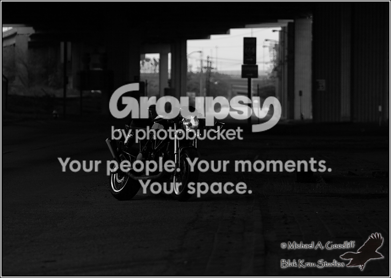
#2 doesn't tell me anything.
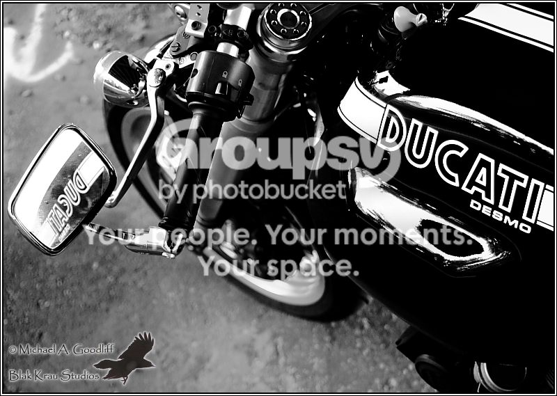
#3 is quite nice, but see if you can increase the depth of field so the lower part of the wheel is in focus also.
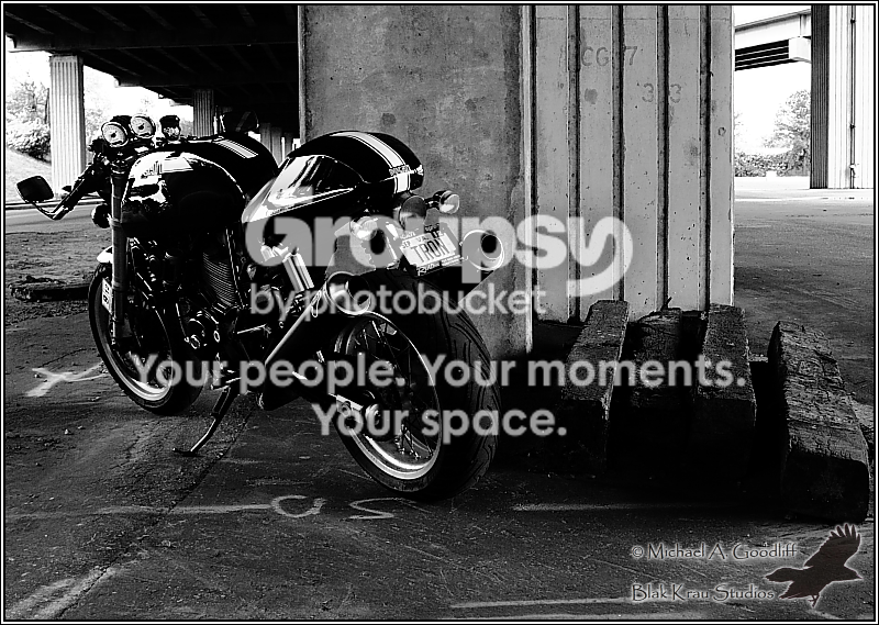
#4 is suffering from a terrible background.
#5 would be much better without the orange line going through the puddle.
#6 is a do-over. Way too dark, not enough subject, and very distracting background.
 
The last is the best.... The real rough and tough look :D
 
#1 is fine, in spite of a distracting background. The reflection is nice, but too bad it is not polished marble instead of just a puddle.
#2 doesn't tell me anything.
#3 is quite nice, but see if you can increase the depth of field so the lower part of the wheel is in focus also.
#4 is suffering from a terrible background.
#5 would be much better without the orange line going through the puddle.
#6 is a do-over. Way too dark, not enough subject, and very distracting background.

Thanks for the tips.

I often end up not narrowing up the DOF I think, because I'm afraid I'll over-do it on everything... if that makes sense. Seems like I see a lot of fake "blurred" backgrounds around, so I'm trying to not be put into that category, I guess. Especially on shots like #6. I agree it is too dark though.

I also need to get better, and more comfortable, with editing my photos. I've got a copy of Paintshop Pro X4, and have yet to really use it. I'm still using the Canon software, which I fear might be part of why my photos aren't that great. :( I'm a little bit of a purist, I suppose, in that I feel if I start editing too much, it'll take away from the "realness" of the photo. I rather like dirt, smudges, lens flairs, etc. Unfortunately, many other people don't, so I think it hurts the interpreted quality of my photos.

I have no idea if any of the stuff above makes sense, but I do appreciate your critiquing. It's the best way to learn, in my opinion. :)
 
1 is easily my favorite. I don't find the background distracting, and I actually like the puddle over something polished. I don't tend to think of motorbikes in the sense of "showroom" but rather in an gritty environment. Imo it's almost perfect as is, though maybe a tinyyyy bit shallower DoF might help find a good mean of subject isolation. I definitely wouldn't want the background to disappear though. I'm actually more distracted though that it isn't perfectly centered horizontally. I'd crop a tiny bit to put exactly in the center.

3) Love the concept, but perhaps too contrasty, bring up the shadows a bit

6) I think this could be a great shot if: you cropped a closer to the bike, put it more towards the left, and increased the overall exposure. I for one, also think the background is fine here.

I like the concepts, but the execution is a bit off imo. I agree with most of Designer's other comments. It most all looks both a little too dark, and a little too contrasty. I know you're trying to balance out editing and "naturalness" but I actually find you might be erring a bit too much on the side of editing already on everything except the first one. I'm assuming that increased contrast was applied(f not, try reducing it). The shadows all look clipped. I'd love to 2-6 with more tame contrast.
 
Oh hai.. I like vehicle photography.

#1: I love the reflection and the rusty exhaust pipe. The background seems a little distracting. Nice shine.

#2: Your signature dominates my attention. Nice crow. Is "Krau" pronounced like crow? I want to say it like "how."

#3: Nice use of the mirror. Good DOF.

#4 Contrast too high, too much black. Composition is ...meh.

#5: Kind of cool. Iunno.. so much blue and so dark. Selective colour lights? eek..

#6: Too dark. Background distracts. Trying to read the street sign. There's always that big signature to look at. :/ Needs a closer crop and better exposure, better DOF.
 
Again, thank you all for the comments.

I do tend to add a little contrast to shots. Apparently on some, I add too much. :) Just worried that things won't "pop" enough, I think, and I'm taking it too far. I'll work on that.

The blue was just an accident, actually. I was using a few pre-set white balance settings in the software, and accidentally clicked on one I use for flourescent lights. "Well that looks kind of neat." I thought, so I kept it. I guess it's my take at being "artsty". :)

The exhaust is wrapped, not rusted. :P

A while ago, I had some photos not just taken without my permission, but actually used in the production of postcards and other souveniers for a local aquarium. Needless to say, I'm a little over-protective of stuff now, hence the big honkin' watermark. :) And yes, it's pronounced like "crow". There's a lot of "Black Crow" stuff out there, so I put my own horribly-spelled spin on it. :)

I may try and re-edit some of these over the holiday, since the weather is supposed to be hotter than blue blazes around here. I'll re-post if I do, using some of the comments from above.
 

Create an account or login to comment

You must be a member in order to leave a comment

Create account

Create an account on our community. It's easy!

Log in

Already have an account? Log in here.

Back
Top Bottom