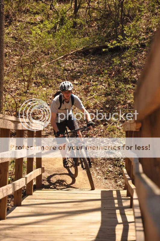
1- Could definatly use some cropping to remove the side of the rail on the right hand side. You seem to have a lot of empty space on top of the biker, which isn’t adding to the picture. I’m thinking a closer zoom in to try and fill the frame more with your main subject.
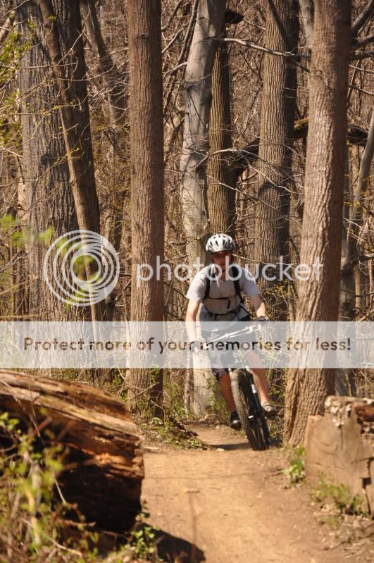
2- Again, too much space on top of the biker. He is pretty out of focus as well
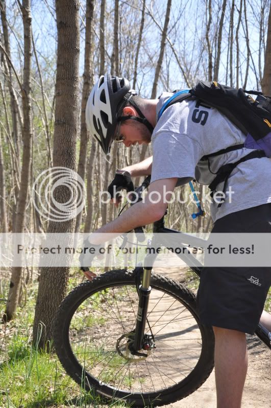
3- Try getting a bit closer in, getting more of his tired face. If you were higher up, you could get his face in and maybe some of the uphill he just climbing, bringing out the tiredness (lol, is that a word?)
4- Good depth in the picture, but it still looks a bit flat. Needs a bit of a contrast boost in post processing
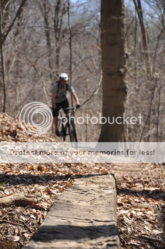
5- Fun concept. I'd wait until he is closer and get the front part of the bike going by the stone. The stone is also a bit too centered
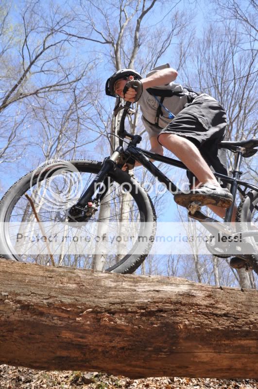
6- My fave in the set, although its a bit tight on the front wheel (which is not fully in the frame). Moving slightly to your left to have his head a bit less centered and the whole front wheel might work
Overall, I think you did a good job! Work on getting more interesting angles and also trying to fill more of the frame with your main subject.
I hope this helps =)


![[No title]](/data/xfmg/thumbnail/40/40299-41bf1ccac2889096fb5f4fcffdd56721.jpg?1734174709)


![[No title]](/data/xfmg/thumbnail/30/30876-d35f95603398bf3423b26c68d344f018.jpg?1734158870)

