My first attempt at portraits.

Sensayshun

TPF Noob!
Joined
Sep 15, 2009
Messages
30
Reaction score
0
Location
Norfolk
Can others edit my Photos
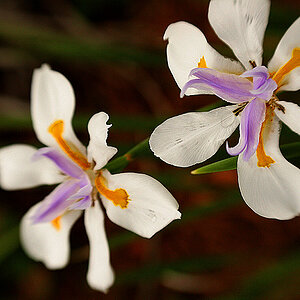
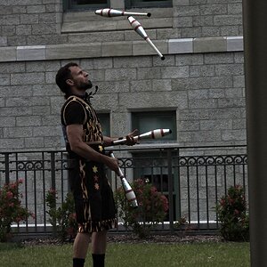
Photos OK to edit
1.
3931594745_8c829d686c_b.jpg


2.
3931596425_9985a7e843_b.jpg


3.
3932380868_4dc82530ec_b.jpg


4.
3932382608_a83facff6e_b.jpg


5.
3932374584_2ec42a551c_b.jpg


edit: Just fixing the piccies, won't be a sec.
 
1. Not bad, I like the idea... seems a tad soft, even for a portrait however.

2. Overexposed? Hazy? The lighting is throwing this one off othwerwise I think I'd like it.

3. (Grabs loudspeaker) Hello! Hey, could you move a little closer? What? Could you move a little closer? What?

Basically, are you photographing the tree or the person... choose one.

4. Nice attempt but the focus is off.

5. Probably the best of the set really, maybe a little too much space around the subject but nice work!

Keep practicing, you have some skills there!
 
While I like your choice of backdrop (old chair), I find that there are too many other things going on in the images that are distracting. If its a true portrait you are doing, aim at getting your subject as the main focus of the image, using the chair as an accessorie.

1- Decent shooting angle but you should move in closer to cut out some of the stuff on the right side

2- Same as above. Note that there is some smoke or something going on that is distracting as well. Nice job on not centering the image, but I'd think about again moving in closer to the subject

3- Looks more like a photo where the tree is the main subject and not the person, so thus not a portrait. I get your intent of using an interesting area / tree for the photo, but it just looks like a guy standing under a roundish tree

4- The most portraitish of your portraits. But you centered him, which I dont like. I do like how you used the lines of the branches as a type of frame.
It also seems that his shirt colour is the focus point of the image, when it should be his eyes

5- Much much better shot of the chair with the subject than 1 or 2. Too much empty space above his head that adds nothing to the image. Having his eyes / head in the top 3rd of the image instead of towards the bottom, filling the frame more with him and the chair would of been better.
 
1. I like it, especially the conception. I like the angle of the chair and subject. I think a little more space below the feet and less above the head would help with compositional balance, as well as straightening the vertical elements in the composition, like the wall, bricks, etc. Our eyes tend to go first to the brightest element, which in this case is the large white panel, so I'd tone that down or eliminate it with a different POV when shooting, and even do some selective vignetting to focus attention on the model more. I immediately thought this would be pretty neat if it were 'grunged up' a bit too, kind of like this as an example:

Sensayshun-1.jpg


2. The subject seems to take about a quarter of the composition, in the lower left quadrant, which I'm not really on board with. Also, I'm not able to connect with the subject without the eye contact, especially at that distance and with all the space surrounding him. The space above and to the right just seems like too much and isn't all that interesting to me. The hazy white look to it, as mentioned by others, isn't working either for me. Perhaps a lens hood is needed while shooting, though you can probably bump the contrast in post to help with it.

3. With the others, I think this is just too far away to be of real interest. It's a nice tree and all, but we're getting so much more, like the uninteresting white sky, the uninteresting foreground grass, and the foliage on both sides that don't really help. The whole thing is centered, and that's not really working very well to draw interest either I don't think. It looks like the subject and tree trunk and branches might be really interesting, considering the elements of light that appear to be present there, and I'd be more interested in seeing that detail much closer. If you can retain the detail after a crop, it might be worth trying.

4. The centered subject isn't working for me here, mostly because he's not engaging with the viewer with eye contact, but is looking out of frame. That said, I think this would work much better if he were positioned more to the right in the composition, giving him more area in the composition to "look into". The branch frame is nice, but a bit too close to his head for my taste, and the lone thin green stick coming in from top left corner is drawing a bit too much interest I think. As mentioned by others, the focus needs some work. I'd also suggest a bit of fill light to deal with the harsh shadows, especially under the chin. Working in bright light like that, a simple white reflector using almost anything from a poster board to a sheet stretched over a frame will do wonders for you, so you might give that a try.

5. I like this and would rate it the #2 shot of the series. I'd say get in closer and exclude the extraneous foliage, especially all the space above his head. Remember, there's nothing wrong with cropping to a square format either - some of the best portraiture ever has been made in that format. This is another one that I think would look really good 'grunged up' some.

It's good work for your first attempt. Keep at it.
 
Thanks for the comments everyone, I'd just like to respond to a few of them.

@ N0YZE:

The second image is overexposed yes. My camera seems to have a tendency towards this but I havn't edited this image yet. It could also have done with a lens hood as I was getting alot of glare.

I think I should've taken a photo just of the tree, that one does seems to be a bit silly on reflection.

For image four, yeah, it's out of focus. My bad.
And for image five, thankyou. And thanks for the comments.

Thanks very much for your time, I'll respond to the others tomorrow as I'm being nagged currently.
 
Buckster I think you turned this so so picture into an great shot.
 
@bigtwinky

Thank you for the comments. Ok I shall do that. On some of the shots I was trying to use the 'rule of thirds' but I'm not sure if I've understood it as well as I should have done.

The smoke is just overexposure and I think I was facing the sun quite badly. I didn't have my lens hood with me, but it's starting to become more essential with the low winter sun.

Yes, I think the tree one is awful, i'm going to edit him out and just have a nice photo of a tree :p

I'll try to get his shirt to stand out less and his eyes more. Note 'try'.

And I'll crop image 5 to take what you said onboard, obviously I can't add more image at the bottom though. What's done is done.

Thankyou :)


@Buckster

Thanks for the comments, I'll definitely try to remember some of the points when I next get to have a go. If someone would care to explain vignetting to me I'd appreciate it greatly. That photo is already 'grunged up' from the original, I do like your image don't get me wrong, and I feel it fits in with the hideous chair very well,

As for image 2, yeah that was me trying the rule of thirds thing. Obviously it's not worked out well :) I've noticed that all other portraits have eye contact yes, I seem to quite like it without, but next time I'll make sure to get both so that I can make more of an informed decision. Also I havn't edited piccy number 2, I shall do and see if I can get rid of the haze.

I won't even comment again on image 3 :lol:

image 4, I get what you're saying yes. I wish this was a crop now so that I could go back and try it. My eyes aren't as good as a pro's yet, what I seem to see as 'pretty in focus' other people don't. I shall have a work on that. And I'll definitely have a go with the reflectors. The shoot was very spur of the moment though as we were technically trespassing so we were travelling light.

Image 5, thankyou. I will give it a crop and see how it comes out. I wasn't very happy with the fencing either, but there's not a fat lot I can do about that. Except go for bokeh and hope it all blurs to nothingness.


Thanks for taking the time to comment guys :)
 

Most reactions

New Topics

Back
Top