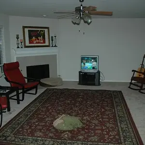
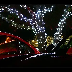
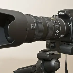
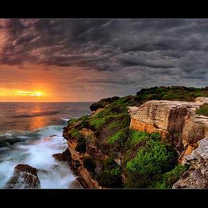
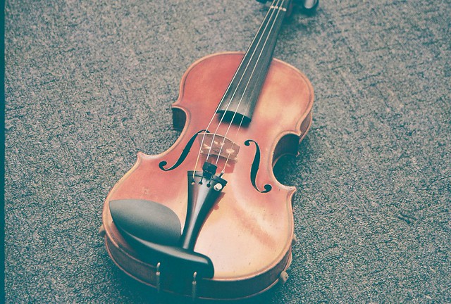
#1 is quite sharp. I also like that you have an extremely limited color pallette. This makes the photo very effective.
There are two things I see that you can do to watch for in the future. First, watch your vertical and horizontal lines... if they are supposed to be vertical and/or horizontal, it's best to keep them that way in the frame as much as possible. There is quite a tilt here. If there were no lines in the background, it may not even have been noticeable.
Secondly, the door handle in the back left... because it's a strong contrast against the darker area of the background and it's an unusual shape compare to the rest of the background, it stands out and is a distraction. I'm not a fan of the darker area to the left generally, but if the door handle wasn't there, it wouldn't be so bad. Bottom line is, pay close attention to your background.
#2 I'm not experienced with film but I believe this low contrast is a result of overexposure. Overexposure looks a bit different on a digital body. It's not 'wrong' persay... but in general, you want to have a good range of dark tones to light tones for the image to be stimulating to the eye. Can you make great low contrast images? Absolutely 100%. But it's usually not by accident. And for this one, I'd rather see the high detail of the shadows. On the positive, I do like how you seemed to have bounced the light off the ceiling which creates great highlights on the wood finish.
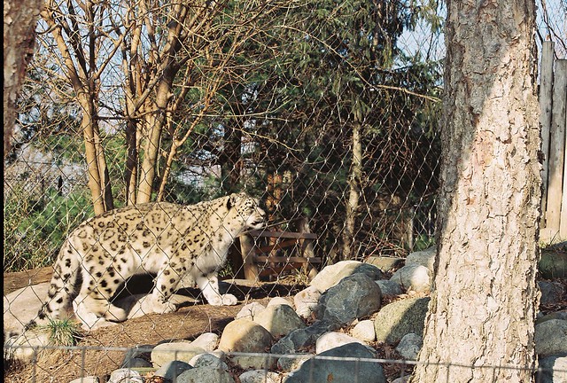
#3 The exposure looks quite good except for the tree is a little 'hot'. It's quite sharp as well. But as you already know, the environment surrounding the.... I'm guessing snow leopard.... is not photogenic. The fence, the branches going everywhere, etc.... I realize you have no control over where the animal is, but try to get in as tight as possible and try to juxtapose the subject against a background that is a little distracting as possible. This may have been the best you could do, that's something you'll have to evaluate on your own.
Overall, not bad at all.



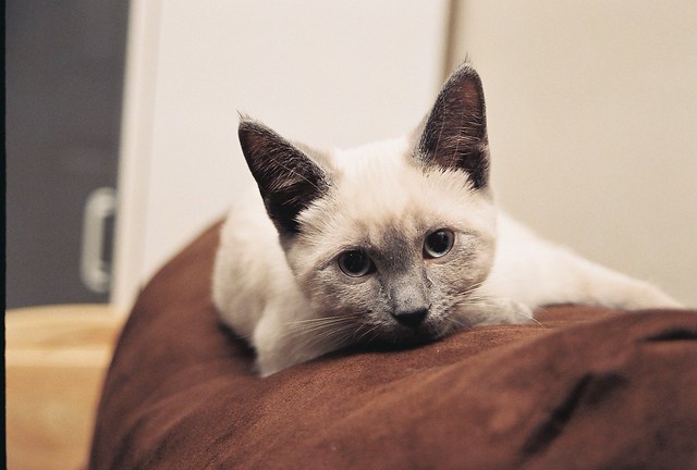


 it's vintage alright. She'll have to work on some more shots of that. She's got hundreds with her p&s




![[No title]](/data/xfmg/thumbnail/35/35266-f58b019dadff6920c09071a847f052c3.jpg?1734166927)