What's new

My First Time... at trying to freeze myself

Meysha

still being picky Vicky
Joined
Feb 21, 2005
Messages
4,152
Reaction score
70
Can others edit my Photos
Photos NOT OK to edit
it was cold. brrrr. :(

and windy....

and I was sad.... because I wanted nice sunny, happy, "oh let's go fishing on the wharf" type pictures.

But then secretly I because happy again... because dreary is good.... dreary is moody. hahaha. :mrgreen:

Well anyway.
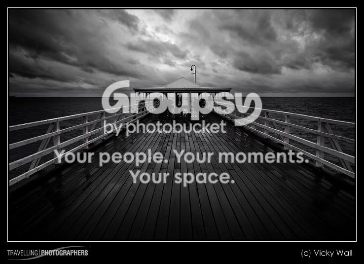
Please let me know what you think. Which one you prefer and why? Or what I can do to make them better. I'm going to be spending a fair bit of time up near this jetty so will be able to reshoot in a variety of conditions.

Colour version
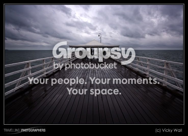
IMG_9176-Edit_punch.jpg


Black and White version
IMG_9176-Edit_punch_BW.jpg


Thanks for looking.
- Vicky
 
Yeah, I like the B&W version also. It gives more of a "mood" to it. Nice shot.
​
 
On my (not-calibrated) screen, the colour version appears with a slight blue cast, which I think is a good thing as it suggests that it was cold on the day you took the picture. This feeling is lost in the B&W version. Also I think you did a great shot with the composition. Howeever, I'd like to see the same picture without the people in the background.
 
I think the cold colour cast in the first shot adds to the concept you have in mind :)
 
Both pictures are really good, the b&w did add a bit of mood to it, but the colored one is very cool to the eye. Nice shot.
 
I really like the color one best. It seems to tell it's own weather forcast; rainy, windy, and cold. The B&W one is good but the color one just seems to tell it's story soooo much better. good job
 
My oh my, what an image. I too favor the black and white one as well. I feel its a stronger image in black and white rather in color.
 
Chris!! Oh my god.. I'm honoured!

I think it's the first time I've been nominated. hehehe :-) I feel so special! Thanks!


And everyone else... thanks! but you've just made my decision so much harder..... because people like both. Sooo.... maybe I'll do something really arty and combine the two - or something weird. Or I'll just print out the colour one really big and hang it in my house.

I am going to make the centre top bit of the sky and bit darker though - because I feel it's a little bright for the mood.... or I could make it brighter as though the sun's coming through.

ohhhh I just don't know. :confused:

But it's great to hear everyone's comments.

Next time I will try different people combinations and positions for sure.
 
Congrats.

Blue was my choice also as the color gives a much colder feeling.
And I like how the blue seems to highlight the wet dock a little more.
 
And I like how the blue seems to highlight the wet dock a little more.

That's my boyfriend's favourite bit of the blue one. and yep... I've decided on getting the coloured one printed.
 
very professionally done, color = better for this picture.
 
ooooooooo!

The mono is EXCELLENT!
 

Create an account or login to comment

You must be a member in order to leave a comment

Create account

Create an account on our community. It's easy!

Log in

Already have an account? Log in here.

New Topics

Back
Top Bottom