First impressions count.
Here’s a thought. There are pictures you take for yourself, and there are pictures you take to show others as stand-alone images. The former are usually snapshots – a record of a time, and place, of something or someone you know, and a convenient memory tickler that allows you to remember the context. The context is important – the meaning associated with the image usually needs additional knowledge that the image does not convey. Absolutely nothing wrong with snapshots – they generally are the honest and “real” representations of an event or place. But without knowing the context, it’s often difficult to understand why the image was taken.
Then there are the images you take to show others. The viewers know nothing of you, or of your subject matter. They react solely to the contents of the image, without any benefit of knowing the context. So the maker of the image needs to think about what the viewer will see and react to. Everything that the viewer needs to understand the image must be in theimage. The best images generally have a central theme, event, or message. Anything that dilutes the meaning whether it is compositional or technical, becomes a negative.
The skill of a photographer is to “see” something, and then to capture it in a way that conveys the essence of the experience to a viewer who has no connection to the time and place where the image was taken. Good images create a strong first impression. They make you want to stop and continue looking. Good images often also evoke emotion. The viewer can imagine a story,or feel the echo of a displayed emotion, or react to the arrangement in theframe...
Look at each of the images you posted and ask yourself the following questions: what will a complete stranger see in the image? What will they feel? What insight will they gain? What will they react to? What in the image will make them want to keep on looking?
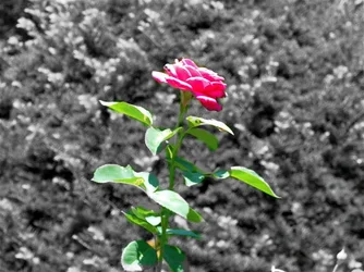
Selective color on flower: Selective color is a technique that is good to do, but is generally misused. It screams “look at me”, and in certain places it helps the image, when it directs one’s attention to some aspect that otherwise would be overlooked. But... you placed the flower dead center. Nothing else is in focus. We understand you want us to look at the flower from the placement. Selective color just makes us look really hard at the flower and we see... a high-contrast, harsh image where the highlights (on the petals and leaves) are burned out. Not exactly the way to portray the delicacy of the flower, which is what I think you were going for.
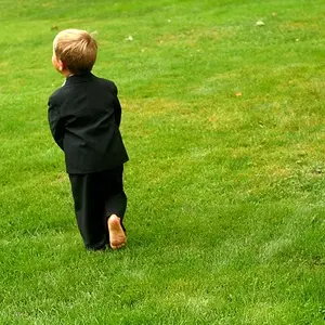
Little Leage baseball: Center placement tells us that this is important. But why? You’re not giving us any clues as to why we need to care.
Landscape. There are three bands of color – the sky, the far-off landscape, and the foreground. What is the subject? What do you want us to see? Is there anything that unites the three together? Is there anything that creates a contrast ora pleasing juxtaposition? Would we get excited seeing that scene, standing at the place you were standing? You obviously saw something of interest – but you forgot to leave us the clues to allow us to see it too.
Yellow leaves on grass. The contrast between the yellow of the leaves and the green of the grassis noticeable. So is the difference of style of the leaves. But. But. But. Too many distracting elements (grass in focus, background leaf debris) to allow us to experience the contrast of the shapes and colors. Plus, the light is very flat, and smooshes (technical term) the subject into the background, where you want separation.
Red leaf. Center placement AND shape AND red color tell us that this is what we are looking at. But the leaf itself is not very distinct (focus, lighting), and it is not clear whether the associated material arond the leaf helps in highlighting its “uniqueness”. There is too much detail in the background,diminishing the impact of the colour. The flat light also reduces the impact of the red.
Fall leaves, low perspective. The low perspective is good. Now we have to work on the rest of theimage. What is the viewer supposed to see? If the background is important, it should be fairly clear – and it is. We see some poles, center left. We see what appears to be a roof on the right edge. But if it doesn’t add to the image you wanted to convey, then the background is distracting. Same for the out-of-focus leaf stem protruding from the middle left.
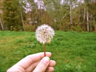
Dandelion held by a hand. Centered image. Horizon line dead center. Dandelion head itself is not very sharp. Its relation to the rest ofthe image is... well, I’m not sure. Maybe that’s the first time a dandelion was seen in that field. Maybe it’s the only perfect dandelion in that whole field. Maybe... but I’m not sure what you wanted me to see beyond the fact that it’s a dandelion held in your hand.
Yes, it’s a long critique. When you’re starting out, it’s hard to know what to focus on. Everything is new, everything is wonderful. Hold on to that feeling. Now help us rediscover the wonder. Give us the clear clues in the images so that we can feel your excitement. Because we can only react to what we see inside the rectangle of the image.












![[No title]](/data/xfmg/thumbnail/36/36133-8b29212f67c25fcf353a0c2f376b1501.jpg?1734168234)