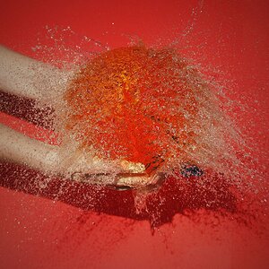
Hey, both would make some wonderful kitchen posters! Fascinating colours in the orange one.
Artemis, you have such sharp eyes - I wouldn't even have NOTICED the blue on the left, if you hadn't mentioned it. What "spoke" to me more (in less favourable terms) was the amount of black on the right...
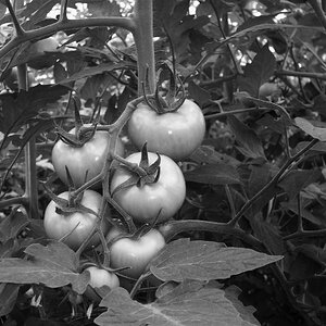
And I am sure the tomatoes are just perfect, if it weren't for my monitor... which makes them look like wood carvings (I have said that often enough now, haven't I? i.e. that colour gradients don't come as gradients, but as layers here?)



![[No title]](/data/xfmg/thumbnail/39/39657-59afb9b38e439b33906e81e4952470ac.jpg?1734173973)
![[No title]](/data/xfmg/thumbnail/37/37128-189b79232a3c6bf0c2c530e4eea0b8cd.jpg?1734169834)
![[No title]](/data/xfmg/thumbnail/39/39480-e4e26ffe5c6148262ac81eff975a5c0e.jpg?1734173580)

![[No title]](/data/xfmg/thumbnail/37/37126-93feffeca0e9e6ad893962c03a7a341e.jpg?1734169833)