What's new

Need advice: b/w or color?

Joerocket

TPF Noob!
Joined
Jun 22, 2005
Messages
547
Reaction score
23
Location
British Columbia
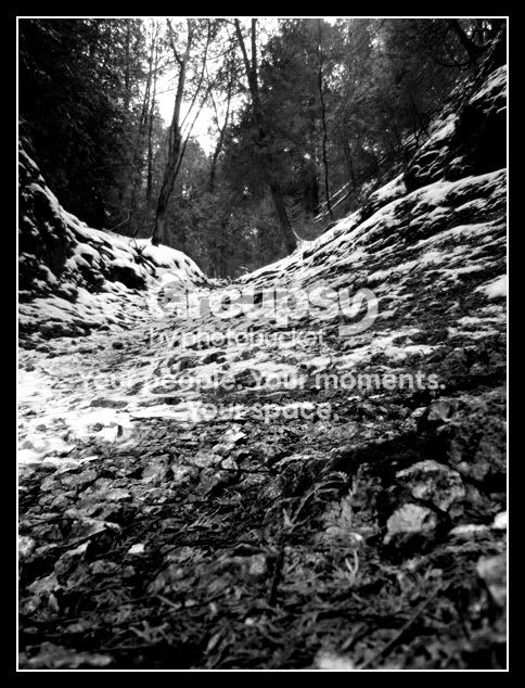
I've been looking at this picture for way too long, can't decide on b/w or color, or if I even like it...

color:
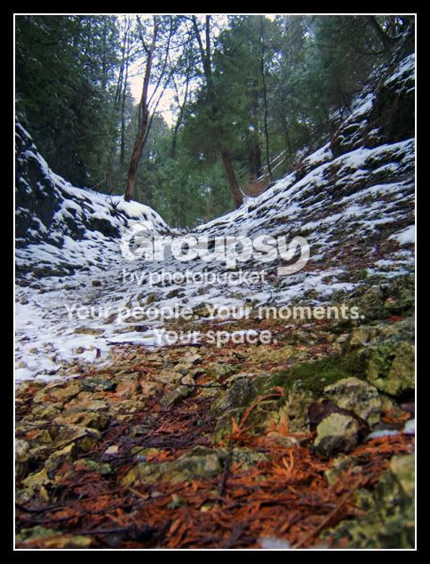
cove.jpg


b/w:
cove_bw.jpg


Thanks in advance!

-Joe
 
I prefer the color. I like how the green trees break up the photo. But, I don't like the bottom. It looks like the flash was fired up close to the ground. Maybe a little more contrast on the b/w?
 
hmm, I didn't use a flash. I did bump up the contrast a bit but I see what you mean it could use a little more. I turned the saturation up on the color one so maybe thats what messed it up. Thanks for the feedback!

-Joe
 
i also choose color.
 
i choose B&W and would remove a small portion of the bottom.
 
I like the colour. The B&W loses the impact of the ground contour.
 
I'll go with the BW but think woodsac is on the right track. It needs more contrast....yer losing too much detail in the FG. Looks muddy.
 
the colour at the bottom of the colour one is so nice i have to say colour too, perhaps a little post processing if you really want to do something with it, say desaturate over a gradient mask combined with a threshold so as the only bits with colour are the lower lighter bits? Although on second thoughts the colour pic is certainly my fave and for me much more powerfull than the b&w

tim
 
tpe said:
...say desaturate over a gradient mask combined with a threshold so as the only bits with colour are the lower lighter bits?

hmm, thats a little over my head with PS, I think I'll put this pic away 'till I can tackle something like that, thanks for the help!

-Joe
 

Create an account or login to comment

You must be a member in order to leave a comment

Create account

Create an account on our community. It's easy!

Log in

Already have an account? Log in here.

New Topics

Back
Top Bottom