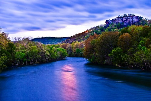
This is a photo I took last night for a competition. The comp. is for a photo of the mountain in the right side. I'm almost happy with it but feel like it needs a touch of something. Any input?
Thanks!
Wow, wild colors. Really, really wild colors! That's the first thing I notice, and it's really overpowering. If you intended to have colors that crazy, then awesome. If not... you may have a problem.
The mountain on the right almost disappears in this photo -- it's relaly about the river, trees, and sky as far as I can tell. Does the mountain really need to be prominent?
The reflection off the river is great and the foreground colors very vivid. The rest of the photo looks a bit purple to me. The skyline just above the mountains is washed out and could use some color. It almost makes it look like you stitched the sky together with the landscape but didnt line it up perfectly.
The color temperature comes off too cold and unnatural. I see some dark haloing around the edges of the background as well. It's a nice landscape photo but it seems too over processed for my taste. I also don't see where the reflection is getting its main light source from. It just seems to come out of nowhere!
Thanks guys, I know the sky looks like I placed it in there but its all natural. I didn't place anything there that wasn't there. The colors are really bright here but I agree they might need toned down. As for the reflection I think I lost some of the sun coming over the mountain. Thanks for the input, Ill play with it some more, maybe kick it down a notch.
I'm gonna have to say that's it's way too overprocessed for my taste. And it definately looks like that sky was stitched in, or just processed to death. Do you have the orignal capture to post? I would suggest toning it down a bit. Unless the comp is wih the sort of people that are into that sorta thing.
I would also ask that picture CC posts be placed in the proper section of the forum next time, please. This is the forum for more advanced discussion of photography, such as exposure methods, lighting, and other techniques and controls.
The only thing I don't like is the very apparent halo effect on the mountain as a result of the tonemapping with a very small smoothing radius. The rest of the image looks fine, although it feels cold.
Idk...I think the reflection on the water is a bit distracting. That's the first thing I see when I look at the picture...I guess it just doesn't look "natural" to me...yet, nothing in this image really looks "natural"...Kind of reminds me of that scene in Willy Wonka (the original) when he brings them into the big room with the chocolate river...
In my honest oppinion, it looks a little overdone. As someone stated earlier, the colors are crazy, intentional or not. Not a bad shot at all just a bit too out there with the colors.
To the OP: if you show us the image as it was straight from the camera without any processing, we might be able to provide you with more useful information on processing.
")


 Hinchinbrook Island - Aussie Great Barrier Reef - in the distance


