What's new

New Batch for C+C (5 pics)

gsm275

TPF Noob!
Joined
Mar 24, 2010
Messages
108
Reaction score
4
Location
Vancouver, BC
Can others edit my Photos
Photos OK to edit
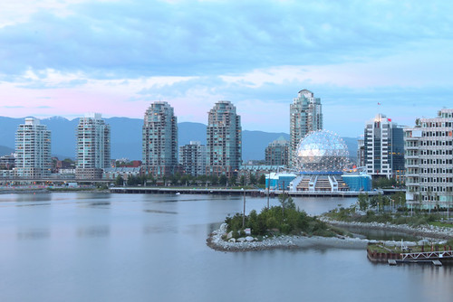
1
4668659182_e24abb06ed.jpg


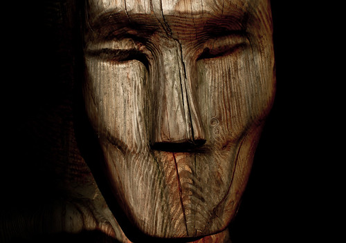
2
4668034465_46cc770bd2.jpg


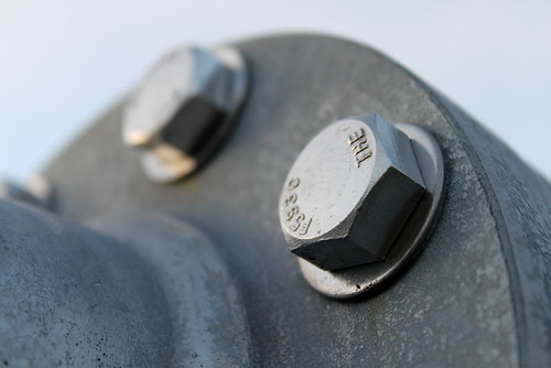
3
4668659702_5b37865c05.jpg


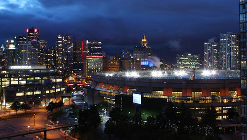
4
4668658168_3c2be09c1f.jpg


5
4658608223_e6139b27d0.jpg
 
That's a nice set of pictures.

5 is great!

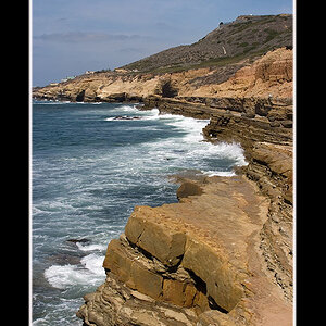
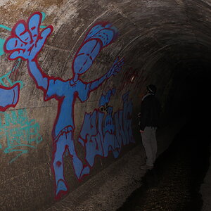
I think the wb on #1 could use less blue and maybe darken up a bit. 4 is also a bit bright IMO but I like the angle and how the focal point somewhat leads to the city.

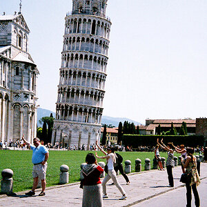
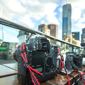
I like #3 as a shot but the subject is a bit boring to me.

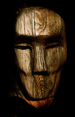
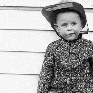
#2 is also a good shot with nice clarity but it seems the top is cut a little low.
 
Good tip on #2, I'll see if i can rework it a bit and repost it when I'm done. I really like this subject and beleive it can be an awesome pic if i manage it right.
 
I think Vancouver is one of the prettiest cities to photograph, day or night. I like 4 and 5 the best, they are all good though. Agree that 1 is a little blue.
 
Here's a recrop closer to the original. I'm not entirely convinced it's more interesting with the full view. Anybody have any thoughts on how i can improve on framing this?

4670485201_822181f224.jpg
 
staples center?

That wooden statue kind of reminds me of that scene from Night of the museum, Gum gum for the Dum dum! haha.. ok off topic..LOL

anyway. Nice pics... :)
 
I really like #2, but personally I like the larger crop rather than the one you have up top.

#3 for me is a great shot but it lacks interest. I like #4 but I agree, it should be a little darker because it seems a little washed out. #5 is a beautiful picture but you should definitley tone down the blue a bit.
 
I like the first closer crop. In film (tv shows & movies) when they want to get a tighter crop on someones face they do a similar shot (cut the forehead off).
 
Yeah, i'm struggling with this one. A little further back is still kinda cool as well. Guess i'm going to chalk this one up to open to personal preference.

4670720379_221a481bd7.jpg
 
1) good horizon...cool shot.
2) good lighting...intersting subject.
3) boring...imo
4) again not too intersting. imo
5) STUNNING!!! great work!
 
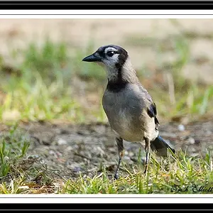
Thx Dak, and i agree with where you are coming from. Personally for 3 and 4 i kinda like'd the tone for them but totally see how the subject is not overly mind blowing. For 3 i'm just starting to get into macro-ish type subjects so it's really my first step into it so just wanted to see how it held up.

Appreciate the feedback!!
 

Create an account or login to comment

You must be a member in order to leave a comment

Create account

Create an account on our community. It's easy!

Log in

Already have an account? Log in here.

New Topics

Back
Top Bottom