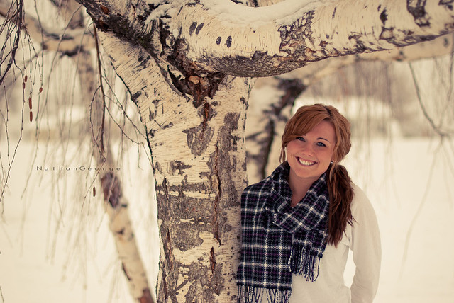
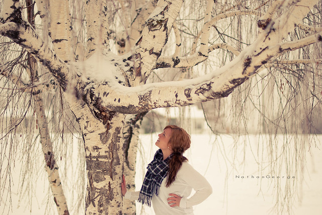
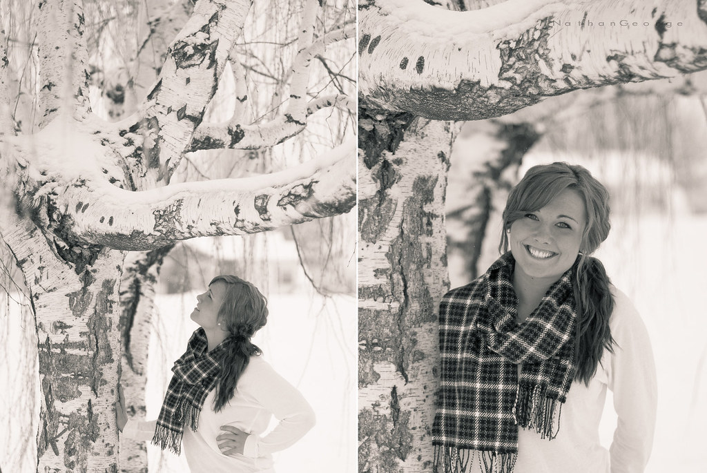
Honestly? I prefer the original edits.
-For these particular shots I prefer the landscape orientations.
--For the ones in which she is looking at the camera, the landscape orientation places her off center, which is more interesting than the centered positioning of the portrait orientation. The portrait orientation version, if cropped even tighter, would be a nice portrait capture.
--For the ones in which she is looking up into the tree, she is almost an afterthought...to me the more eye-catching subject is the tree itself. The landscape orientation shows much more of the interesting limbs, branches, and twigs of the tree than does the portrait orientation.
-There isn't as much contrast in the B&W versions as I would like to see. Admittedly it might be tough to create contrast from these particular images. It looks like the light was flat that day. The images are predominantly white, between the snow, the tree bark, and her sweater. Even her hair and skin tone are close enough to each other to be close when converted to greyscale. The only element that really contrasts right now is the scarf. You can probably create some nice contrast, but through dodging/burning and using masks rather than image-wide modifications of levels, etc.
-As for the color versions, at first glance I thought there was a bit too much of a yellow cast to the images and was going to suggest tweaking the white balance. But the more I look at them the better I like the warmth to them, it works really well with her red hair and skin tone.