SweetLeaf1189
TPF Noob!
- Joined
- Nov 13, 2007
- Messages
- 15
- Reaction score
- 0
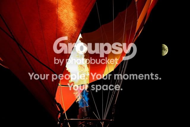
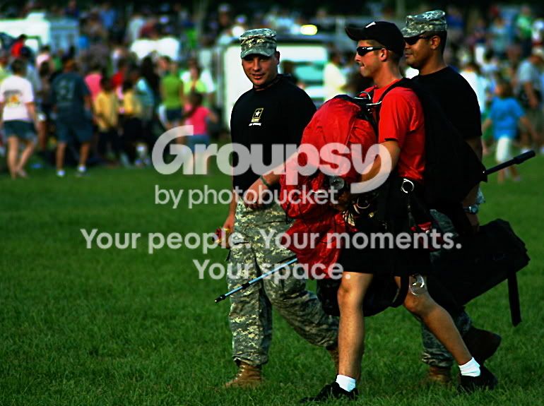
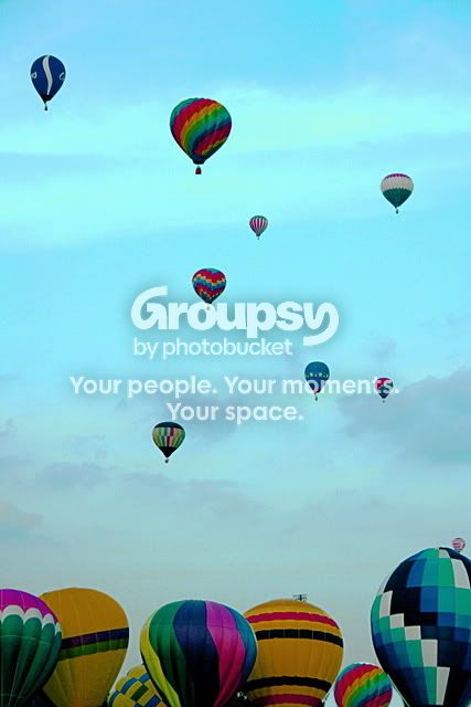
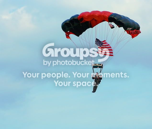
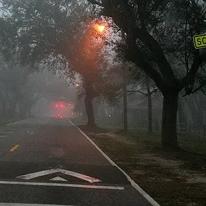
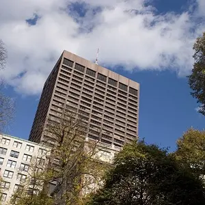
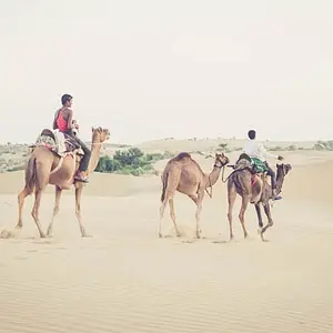
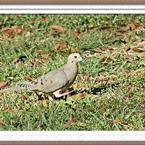
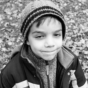
Ok, not so new, but I completely forgot about this place. I only pick up a camera from time to time, so I'm not too serious about it, but I would like to get some general critiques  I hate editing pictures (I'm just not patient enough to experiment with it!) so most of them just have general color balance, resizing, contrast, etc. editing. These were taken at some kind of balloon festival in Baton Rouge - there were also Army Special Ops Skydivers doing demonstrations (which was really neat), and of course trying to recruit people, lol. Anyways, I'm sorry there are so many - I didn't know which ones to post =/ I'll stop rambling now.
1.
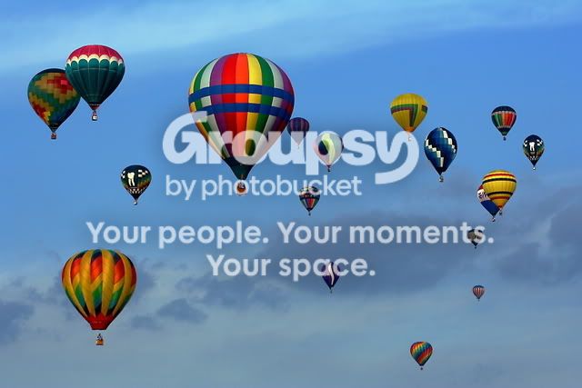
2.

3.
4.
5.
6.
7.
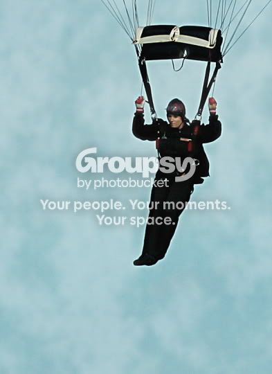
8.
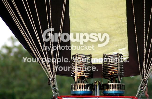
9. Just trying out some silly effects with Gimp.
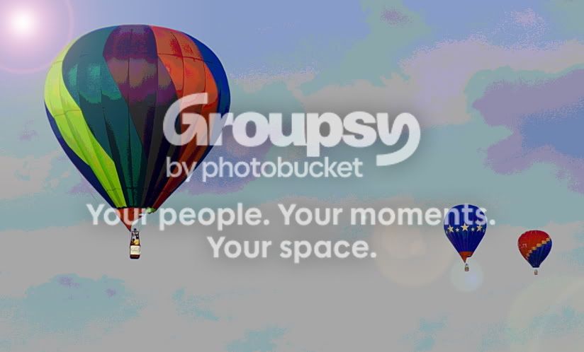
10.
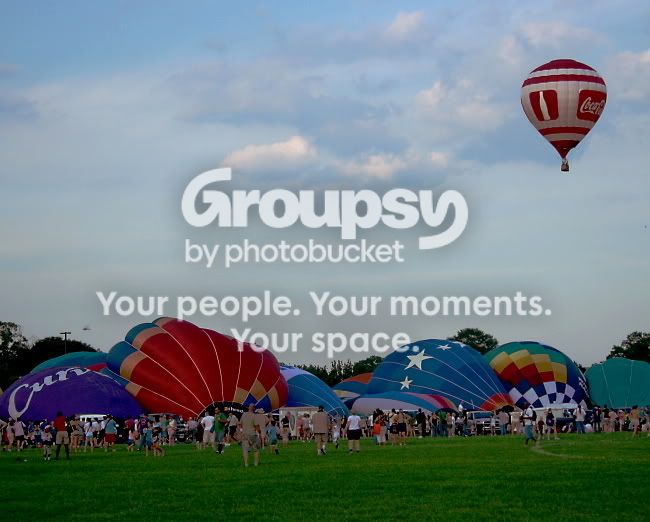
I suppose that's all I'll burden you with for now
I hate editing pictures (I'm just not patient enough to experiment with it!) so most of them just have general color balance, resizing, contrast, etc. editing. These were taken at some kind of balloon festival in Baton Rouge - there were also Army Special Ops Skydivers doing demonstrations (which was really neat), and of course trying to recruit people, lol. Anyways, I'm sorry there are so many - I didn't know which ones to post =/ I'll stop rambling now. 1.
2.
3.
4.
5.
6.
7.
8.
9. Just trying out some silly effects with Gimp.
10.
I suppose that's all I'll burden you with for now



![[No title]](/data/xfmg/thumbnail/35/35948-700e0d840da0ca73727b1bd6d99b4142.jpg?1734167751)
![[No title]](/data/xfmg/thumbnail/35/35953-1a8b92df0115ff7026f31b78855ac815.jpg?1734167764)
![[No title]](/data/xfmg/thumbnail/32/32953-da4fe78e854d5dbe210d58591ccf42d4.jpg?1734162831)