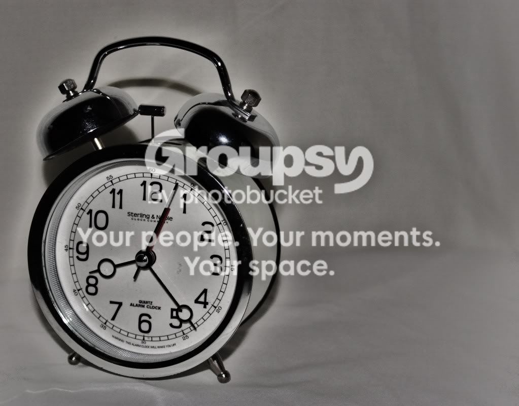
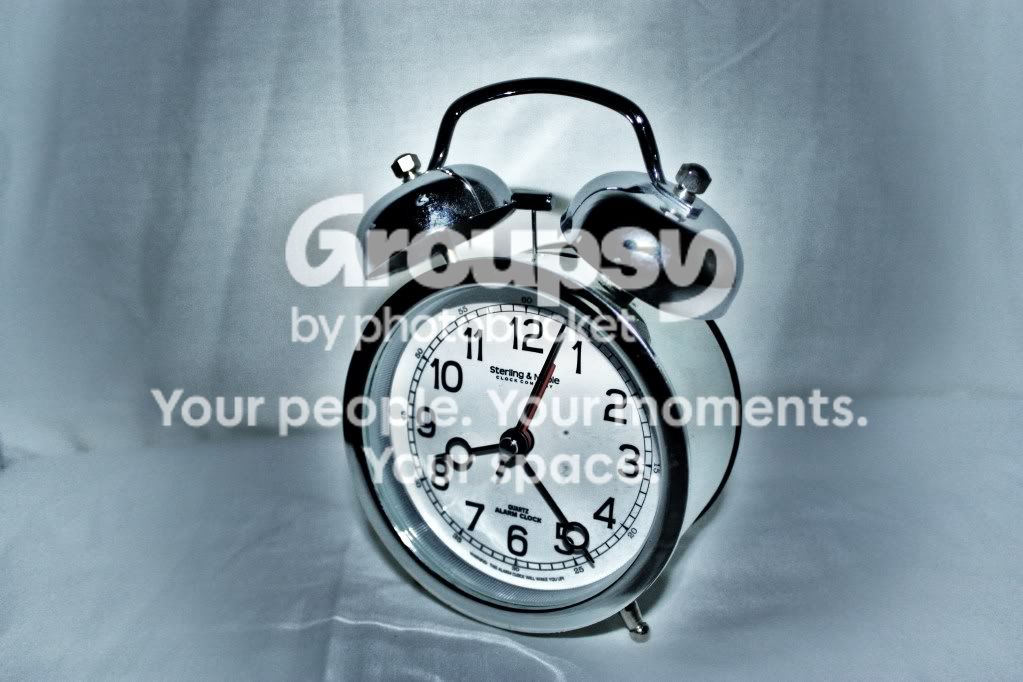
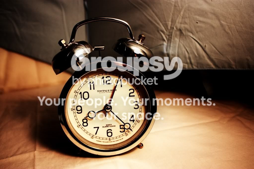
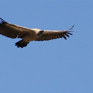
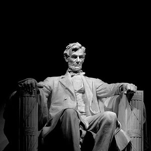
No.3 is by far the best picture out of them (maybe the best picture I've seen you post up so far in fact.) The composition is good, the lighting is just right, the bronze tint is nice and the focus is good.
The only part that ruins an otherwise nice stock picture is the Black triangle on the right hand side - there is also something in the middle of this area that is poking out and catching light, it's offputting and draws more attention to the area... if the backdrop was extended it would be much more pleasing to the eye.








![[No title]](/data/xfmg/thumbnail/37/37604-7ad625e983f92f880eb65a264eeef5e4.jpg?1734170732)