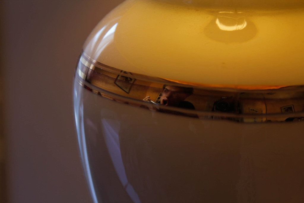
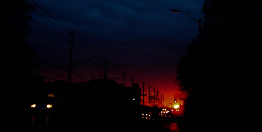
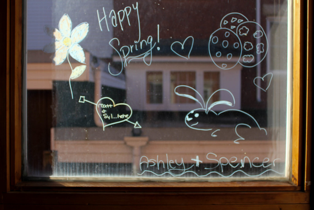
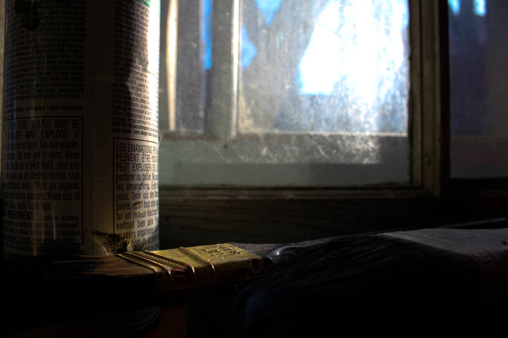
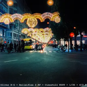
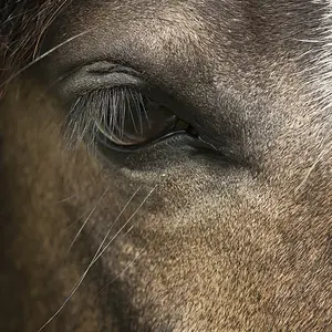
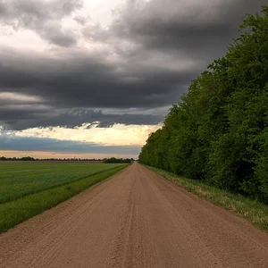
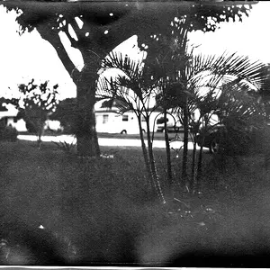
Nice effort, but I agree that none of them do anything for me. Poor focus on most, poor composition, and rather dull subject matter. I do not say this to be mean, I am just being straight to the point so no need to try and defend yourself. Just because the word "Spring" is in #3, does not mean it embodies spring. The grimy window and all of the crap OTHER than the word "spring" that is written there distracts from paying any attention to the reflection ( which isn't very great either mind you ). Its a great idea and concept, why not try re-creating this on a window that is reflecting something more spring-ish? 4 and 6 seem to be the worst. Bad focus, extremely screwy subject matter. Its as if you think a wierd angle or focus automatically makes some lackluster thing art. #2 is slightly crooked and there is not enough shape detail in the silhouette to really give impact to the sunset. The car in the bottom left also doesn't help it. Personally I think that #5 has the most potential with some better lighting, better composition and maybe a few more elements to tie into the painting theme. Perhaps more of the room in the background half-painted, or some of the window sill painted as to show the point of the composition. Even without the added elements though and better lighting and framing, it could be a decent shot. You are new here so welcome. Do not take offense to people helping you. There is nothing worse than someone posting for comments but not being able to accept that their images aren't as great as they thought. We have all been there and its experiences like this that help your eyes to see in a different way. I look back at my old shots that I thought were so deep and artsy and laugh.