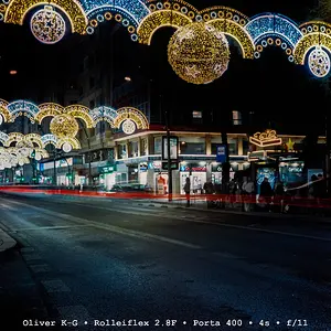
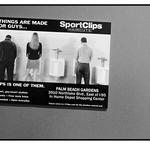
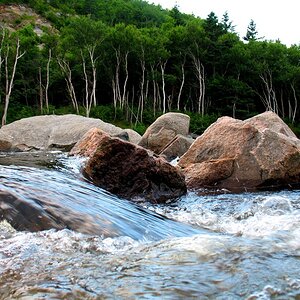
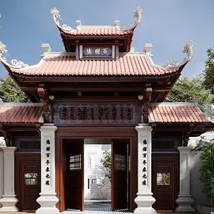
Composition is very central in each and everyone of the first five.
So that seems to be a point you might want to work on: composing so that the photos get some more "tension" in so far as they are not so all balanced, which is what a central composition does to them. Focus with your central focus point, keep the finger half pushed and quickly recompose from there putting your subject to a side.
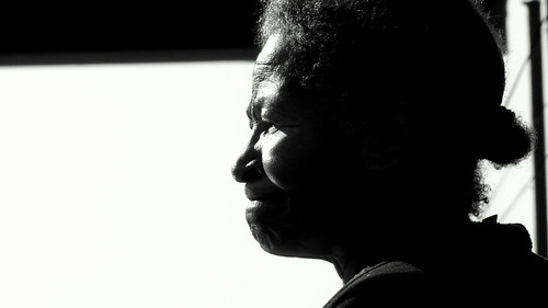
Though I must say the centred composition works with the first, it is all about contrasts there, so why not contrast (too) the all empty lefthand side to the filled-with-face righthand side, just like black contrasts with white and the black line at the top contrasts with a) the white below and b) the high-lit parts of her face. To my mind, that photo really has quite something.
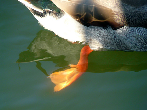
The duck foot is well spotted, and I appreciate the fact that you took an UNUSUAL photo of a duck. To my mind, it would become even more cryptic (and thus interesting, as it is then even less straightforward) if you cropped off most of the duck's body, leaving us to look at only the foot underwater and the duck's reflection. Just a thought I'm having... don't know if it'd work...
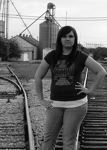
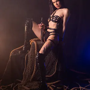
Don't know what to say about the third. The noise bugs me. The fact that the frame cuts through her knee while there is so much headroom bugs me. Her dark eyes (almost like black holes only) with no catchlight in them bug me. She looks downright angry here. I don't find her pose flattering at all... in short: that one I just don't like. But that's just me, of course.
The next two are nice - the central composition of the flower doesn't help though. But DOF (depth of field) is ok. The dip in the sunset photo looks good enough, I can live with the central composition there. And this kind of sun, the colour gradation in the sky, the silhouetted foreground ... all that works.
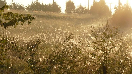
As to the next set: shooting against the sun as you did when you tried to capture the meadow and the blooming grass was a big risk and you pulled it off well for the most part. The poles in the background are a mild distraction, though...
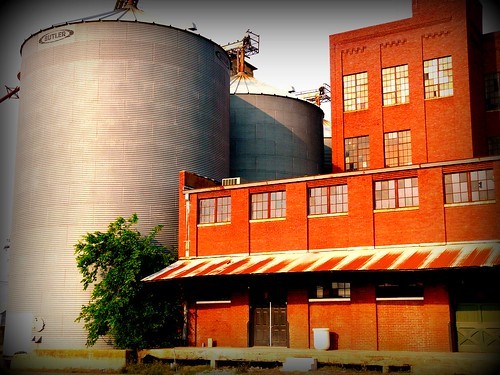
I don't like vignetting. Full-stop. Can't help myself. So whenever someone vignettes their photos, I'll look and think "Ugh, a vignette again!" Sorry. Otherwise I do like the square as opposed to cylindrical building, and the red against the silvery colour, and the colours as a whole.
The last doesn't speak to me, but that's just me. As you can tell, it speaks to others. So there

.