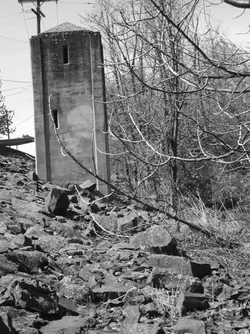
An interesting subject. A nice lead in with the rocks; they take the eye right to the subject.The telegraph pole and the horizontal structure in the background and the branches in the foreground are a bit of a problem, as I see it, because since they are in contact with the subject, they cause this to become a little static. Taking a slightly different position to keep the tower free would improve the overall effect, imo. Also, the tonal range could be better: it's a little on the grey side as it is. B&W was a good choice for this.




![[No title]](/data/xfmg/thumbnail/37/37117-26c892e756b53ed0359fa90b7ebd99c9.jpg?1734169832)
![[No title]](/data/xfmg/thumbnail/37/37121-fda7b1957cb0d0be7bab1ddd3ec87847.jpg?1734169832)
![[No title]](/data/xfmg/thumbnail/32/32953-da4fe78e854d5dbe210d58591ccf42d4.jpg?1734162831)
![[No title]](/data/xfmg/thumbnail/40/40307-b3813381d3c1ef8282c72905405b50fe.jpg?1734174715)
![[No title]](/data/xfmg/thumbnail/41/41786-0de67cacf7270937b4833f67d003f9c2.jpg?1734176090)