New to the site - Few Pics for your C&C

JNA Photo

TPF Noob!
Joined
Mar 22, 2009
Messages
18
Reaction score
0
Location
Philadelphia, PA
Can others edit my Photos
Photos OK to edit
I have always enjoyed photography, and I have recently decided to get more serious about it. I have a Nikon D60 with the 18-55mm kit lens, and am saving to buy a better lens soon. I have been doing a lot of reading and researching online, and I have found this site to be very helpful.

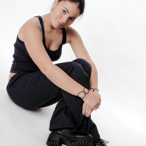
The lovely model in these pics is my wife, who has been modeling for about 3 years now.

Any C&C that can help me to improve will be greatly appreciated!

2009-02-28-027bw.jpg


2009-03-08-048.jpg


2009-03-07-037.jpg
 
Take my criticism with a grain of salt as I am a noob, however here goes.

# 1 is nice and interesting in my opinion. #2 I like the most the light from the window is soft...looks great, the thing I dont like is that her arm is cut off...the wine glass is holding in the shot by only the one finger. Correct me if I'm wrong, I think it's best if there is continuity in a limb (ie: from shoulder to the hand, so there is not what appears to be a random finger in the shot) I hope I'm explaining this right. I think overall they're nice shots, and a very pretty model.
 
Thanks, Sly for your feedback. Now that you mention the one finger in Pic #2...I can now see how awkward that looks. That's why I am here asking for C&C...to make my work better!
 
with my noob eyes, all looks pretty good (exposure wise), #1 i think is the best one, #2 first of all, the fence is distracting, the way you frame the shot, if you put your attention to her hand holding the glass wine the finger looks kinda awkward sitting on the edge of the pic. #3 it needs a little more of DOF imo.
 
First of all, the kit lens is a good lens. I'd recommend getting your photos to a level you feel are very good before you upgrade. Many people fall into the thinking that better equipment guarantees better results, but it's simply not true. That being said, I think #1 is your strongest, although it's a bit to gray for me. I like the minimalist look of the half face, no background, but you should try to achieve more contrast out of it. Your other two are ok but it takes a lot of practice and more lighting to make shots like this great. If these kind of shots are your thing, you should invest in some proper lighting before a new lens.
 
#1 - I think this photo could use a bit more contrast. It's a bit flat.

#2 - Watch your background, the fence is very distracting and it's a bit of a snapshot than anything.

#3 - Not that there is anything wrong in centering your subject but I think the rule of thirds will be great to apply here. I would re-crop and get her to the top right third. I think all that space above her is not necessary. Also, not sure if the focus fell somewhere else than her eyes.
 
Thanks everyone for your feedback. I will take all of these ideas into consideration.

I have a continuous lighting set up with a muslin background that I have been practicing with...I still haven't gotten it to a point where I have it down yet as well as I would like...but I will continue to practice practice practice!

-Jim
 

Most reactions

Back
Top