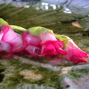
I think the look and the treatment is quite beautiful.
Some small things.
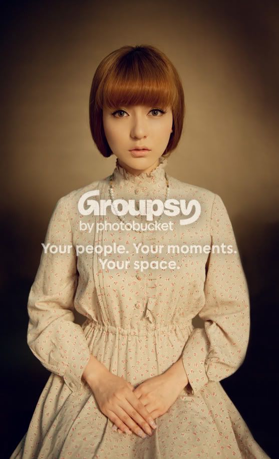
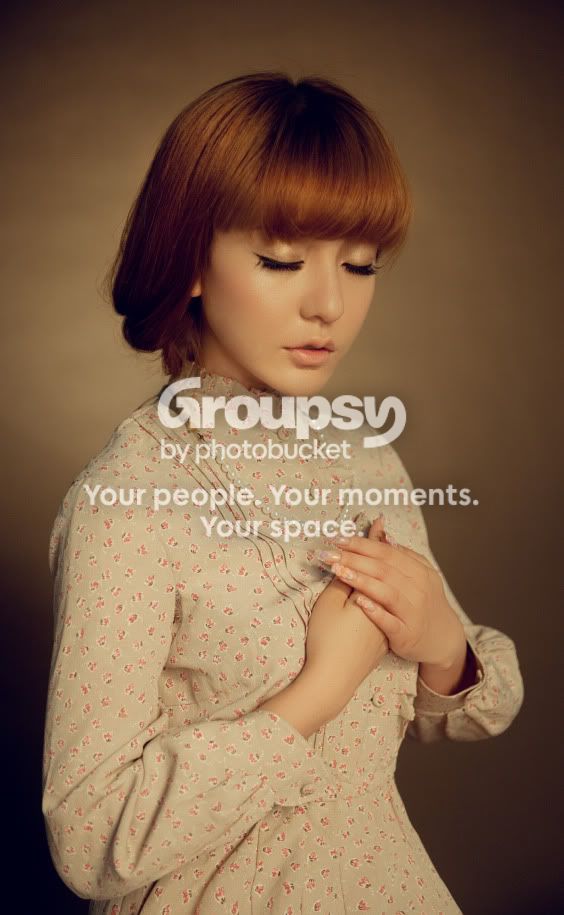
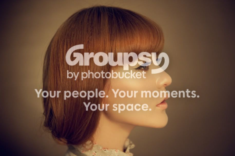
The aspect ratio is rather strange and doesn't seem to conform to any standard. You have plenty of room and I wonder why you chose that crop.
In the second, the burning-in is much more in front of her than behind and she looks to be tilted a bit. (2 degree clockwide seems to make a big difference.
In the third one, that large amount of heavily vignetted space in front and book looks odd, almost like she is in a burning building. Why not a portrait crop?



![[No title]](/data/xfmg/thumbnail/31/31757-4f5257d19be4e34c6bdcbd2519380d53.jpg?1734160480)
![[No title]](/data/xfmg/thumbnail/37/37092-c446ffb89610a57384a51ac5254beffd.jpg?1734169827)
![[No title]](/data/xfmg/thumbnail/36/36100-56ca0f8143ffca369fbf5f3dfe9cabd4.jpg?1734168051)
![[No title]](/data/xfmg/thumbnail/42/42062-136a63ad7d0bd740e99ca1fc477f214c.jpg?1734176463)
![[No title]](/data/xfmg/thumbnail/42/42063-eb634e07d8ad641481cc20fb5cf4d6de.jpg?1734176464)