Newbie here for some friendly CC.

krystalynnephoto

TPF Noob!
Joined
Jul 8, 2013
Messages
190
Reaction score
61
Location
Japan
Can others edit my Photos
Photos OK to edit
I've been terrified of posting here, because I've seen a few people ripped apart. You guys mostly seem to be fantastic artists and I've been wowed by the portraits I've seen posted by a lot of you. So at the risk of sticking my neck out there, and hopefully gaining perspective from others, to better myself, I'm biting the bullet and showing some photos. Try to be nice, I'm working with a beginner DSLR and stock lens, but wanting to grow.. lol Thanks in advance.

DSC_0230.jpg


DSC_0227.jpg

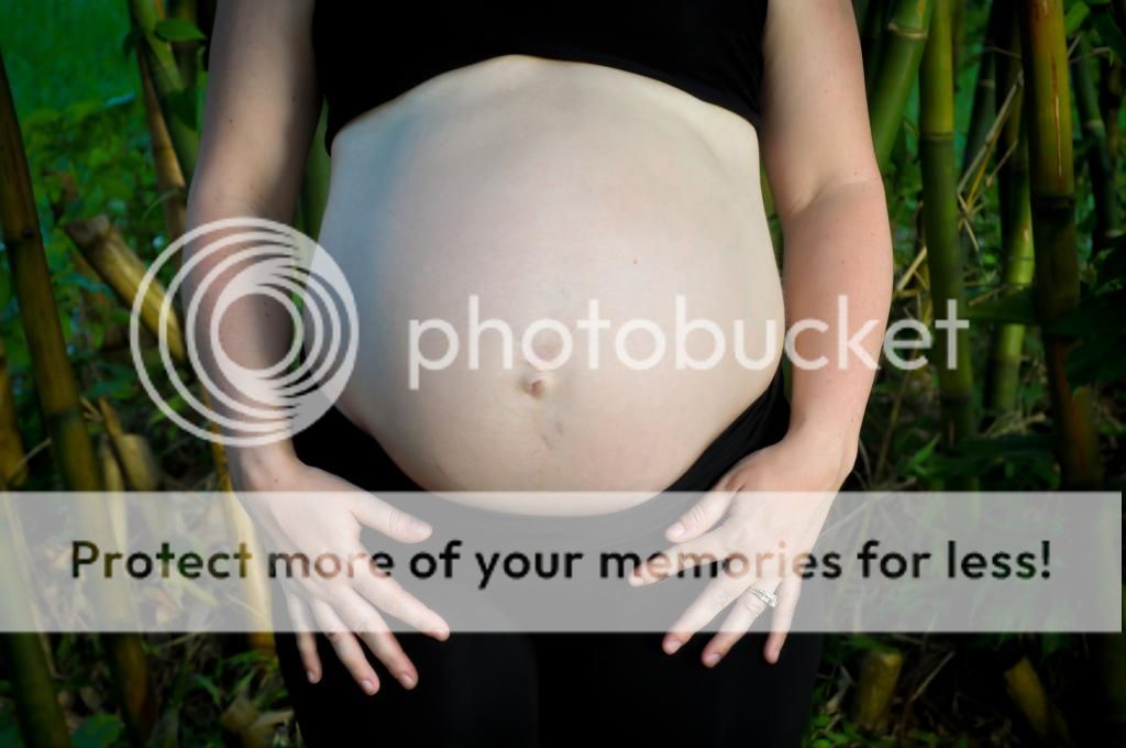
I tried to remove the blue on the left side of her belly, but couldn't get it to go away. :(

DSC_0208-4.jpg

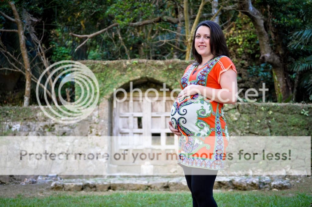
This is one of my fav images, though I hate that I cut her hand off.

DSC_0188.jpg
 

Attachments

  • $DSC_0208-4.jpg
    $DSC_0208-4.jpg
    105.2 KB · Views: 101
Welcome aboard! Don't be nervous about posting here, there are experience levels ranging from "What's a DSLR?" to "WOW" on this forum and it's a great place to improve on what you can do, so thumbs up for deciding to post.

I'd comment on cutting off the hand, but you already did.. I think you have a decent first post here, honestly. My suggestion initially would be to warm your shots up a little bit. Looks like the white balance may be off a bit. In #3 I also thought the top of the photo was a bit distracting.. the white beam across the top in particular. I like the composition in #4 but the background seems off a little.. maybe a bit more out of focus or the subject positioned just a bit differently to include it better? As it stands, the branches above her head are just in focus enough to be "growing" out the top.

Overall though, nice job! Keep them coming!
 
I do not like the cliche bare belly, mid section-only maternity shot. I don't find it particular aesthetically pleasing - and just says BOOM PREGNANT! to me. It doesn't say much about the mother, her excitement, her nerves, her anticipation, just that there is a parasitic organism swelling the abdomen - while perhaps on one level true, hardly the aspect of pregnancy that is beautiful. There are some white balance issues, the color seems cool and oddly yellow. The black clothing is a bit of a black hole, but I do see some detail - avoiding a newbie mistake in this situation.

There are some technical issues with the seated poses, I'll let someone who knows more about this topic tacle that, and of these, the mother standing is the best, but I am wondering to myself what the subject here is, the location or the mother - and what the location has to do with the mother. You seem to handle the overall exposure pretty well with good contrast and bright colors, decent detail in the hair, if even a little dense on the shadow side. The skin tone looks pretty good, warm - as you'd expect from a pregnant woman - but not 'red' like she's running a fever.

Overall, not a bad start, and I don't want to make you feel like you're doing a terrible job - because you really aren't. Keep at it :)
 
Welcome aboard! Don't be nervous about posting here, there are experience levels ranging from "What's a DSLR?" to "WOW" on this forum and it's a great place to improve on what you can do, so thumbs up for deciding to post.

I'd comment on cutting off the hand, but you already did.. I think you have a decent first post here, honestly. My suggestion initially would be to warm your shots up a little bit. Looks like the white balance may be off a bit. In #3 I also thought the top of the photo was a bit distracting.. the white beam across the top in particular. I like the composition in #4 but the background seems off a little.. maybe a bit more out of focus or the subject positioned just a bit differently to include it better? As it stands, the branches above her head are just in focus enough to be "growing" out the top.

Overall though, nice job! Keep them coming!

Thanks for the solid advice! I appreciate your time. I'll keep all of that in mind in the future.
 
I do not like the cliche bare belly, mid section-only maternity shot. I don't find it particular aesthetically pleasing - and just says BOOM PREGNANT! to me. It doesn't say much about the mother, her excitement, her nerves, her anticipation, just that there is a parasitic organism swelling the abdomen - while perhaps on one level true, hardly the aspect of pregnancy that is beautiful. There are some white balance issues, the color seems cool and oddly yellow. The black clothing is a bit of a black hole, but I do see some detail.

There are some technical issues with the seated poses, I'll let someone who knows more about this topic tacle that, and of these, the mother standing is the best, but I am wondering to myself what the subject here is, the location or the mother - and what the location has to do with the mother. You seem to handle the overall exposure pretty well with good contrast and bright colors, decent detail in the hair, if even a little dense on the shadow side. The skin tone looks pretty good, warm - as you'd expect from a pregnant woman - but not 'red' like she's running a fever.

Overall, not a bad start, and I don't want to make you feel like you're doing a terrible job - because you really aren't. Keep at it :)

Thanks! :) Appreciate your advice, truly.
 
Sorry for the FB quality, but I tried to improve these two shots, based on your comments.

$970097_521788424536689_776706855_n.jpg

$1000816_521788331203365_1449871398_n.jpg
 
One of the things that often differentiates the truly skilled photographer from the mediocre is his/her treatment of the background. This is often just as important as the treatment of the subject. In the case of your post, the technical quality is decent; numerous small issues have been noted, but to me the single most glaring issue is the background. In #s1 & 2, you have a strong linear pattern, which while nicely under-exposed with respect to the subject, still has enough detail to distract the eye. Greater separation (>10') as well as longer focal lengths and/or larger apertures would have helped with this.

In #3, you came very close, but the inclusion of the tree/green & white pattern again really pulls the eye away from the subject. Moving the subject down and shooting from slightly above would have helped here. On that note, always try and shoot from eye-level or just very slightly above. If you MUST shoot from below the subject's eye-level, have them lower their head just slightly.

#4 has just about all of the background mistakes it's possible to make; areas brighter than the subject (remember, the eye is naturally drawn to brighter areas over darker), strong linear patterns, complex multi-coloured elements, and trees 'growing' out of her head. In this case, moving her closer to the background and again shooting from above (not much but a little bit) using long, fast glass would have allowed you to show only a small part of the stone wall and/or gate which might have made a very nice background, rather than including so many distracting elements.

While that may sound harsh, it's not meant to be. This is one of the single most common mistakes that new photographers, especially new to portraiture photographers make. It takes some practice, but you will soon learn to 'see' the background as it will appear in the final image the same way you 'see' the subject. Keep shooting!

Just my $00.02 worth - your mileage may vary.

~John

Thanks! Lots of useful info there.
 

Most reactions

Back
Top