What's new

Night Time Spot C&C

Dionysus

TPF Noob!
Joined
Sep 23, 2008
Messages
454
Reaction score
2
Location
Newfield, NY
Can others edit my Photos
Photos OK to edit
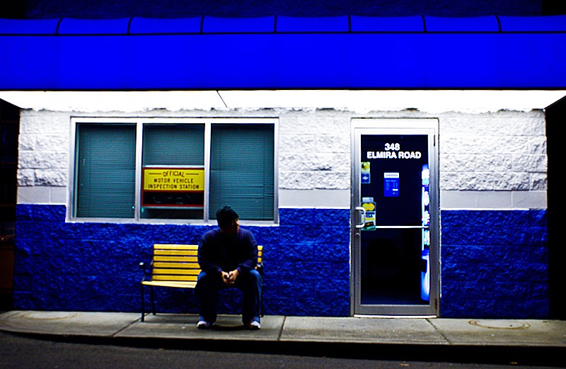
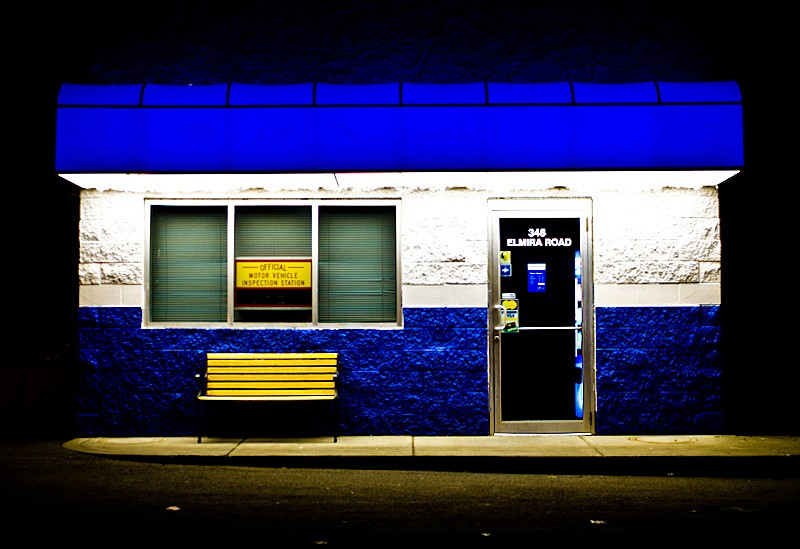
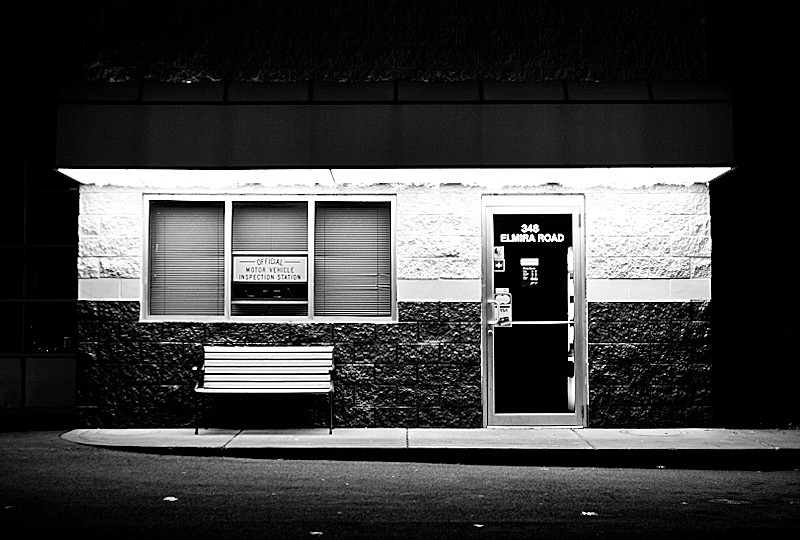
So i was out at around 10 on a covert mission to buy a video game at walmart, when I passed this oil and lube shop. I pass it countless times on my way to and from work. I stopped this time, because Ive never seen it at night, and I just fell in love w/ the lighting and the color, on this particular night time trip. So I pulled in and took a few shots and left before people got the idea to call the cops.

I had fun trying some self portrait shots. i never meant myself to be well lit. I wanted the heavy shadow FYI. and the SP are kind of soft because i moved the camera and adjusted the zoom, but forgot to readjust the focus. but i think it still came out ok.

I can already hear the "boring" comments LOL,but I kinda liked how it turned out. Anyway couldnt pic favorites so here are all 4:
d582bec83f68177d5f957ac46205ad21.jpg


4595eee2cef967f5bc1b7ffe792ab1f3.jpg


75dc3685215e55fef065f6919c79aac9.jpg


3ffb222286ce09b88358559fedadcf59.jpg
 
I completely love the first one. I suppose its the contrast in it. :)

The second one is alright, but to me, it just doesn't really do much.

I think on your self portiats, different colored clothes to add contrast would have looked neat. You sorta look like your blending into the wall... JMO.
 
The first one has potential if the white area wasn't blown out and the blue awning didn't have its blue pegged to the max. Would be a hard capture but I like the way the light falls off. Makes it look like it's on its own little island.
 
ya had i known i would be attempting a self portrait i would have worn different colored clothes...but it was a spur of the moment shoot.
 
The first one has potential if the white area wasn't blown out and the blue awning didn't have its blue pegged to the max. Would be a hard capture but I like the way the light falls off. Makes it look like it's on its own little island.

ya, i tried calming the light down a little in post, but thats as much as i could do, and still keep the overall feel of the pic.
 
I actually really like the first one. Very artistic, bordering on abstract, in my opinion. I also like the way you left some black space at the edges; in the other two you seemed to have cropped some of the building out. Otherwise, I really like those shots.
 
I really like the first one a lot. Typically i don't have much taste for photos with such high saturation, but this really appeals to me. The b&w one looks very cool as well.
 
maybe its just me, but the colors are so ridiculously edited its almost hard to look at. idk, i think id like it without all the editing.
 
i wanted them to be overly saturated. shooting at night w/ that kind of lighting, its hard to get the camera to capture the colors exactly as you see them. the blue that came even from perfectly exposed pictures just wasnt the blue that i saw. saturation is a matter of taste.

i just knew what caught my attention as I drove by...it was the crazy bright blue, and for me, if that didnt stand out, then nobody could see what i saw. i view photography as more than just taking perfect exposures of subjects..i view it as art as well. a painter can choose to paint a scene as perfectly detailed as possible, or they can paint it abstractly, or they can highlight shadows and colors, its up to the artist...not everyone will be happy w/ his choice, but some will understand what hes going for.

not saying i'm an expert artist or anything, just sharing my opinion on my beliefs on understanding the artists/photographers intent and approach, in viewing their work.
 
also, often times the taking of the photo is only the first step, not the end all. its very rare that you capture exactly what you wanted, as you wanted. it's not just a digital thing..photographers manipulate color, saturation, and everything else in the darkroom as well.
 
the first one is really great. amazing colors, and i love how ordinary stuff can look great to photographers... great capture it definitely bounces out of the photo
 
I also really like the first one. To perfect it, I'd desaturate the blue just a touch and clone out the bit of blue wall above the awning. This would give more of a feeling that the shop is just standing alone.
 
imo they are all neat shots, but I like the composition of the first one the best. as someone already mentioned, the black space on either side of the building really adds to the feel of the shot for me. in this case, I like the ramped-up sat and contrast as well. :thumbup:
 
I love the subject and composition. That being said for my taste they feel a little over saturated/exposed but like u said thats what you were going for so its a matter of taste. I saw it said it was ok to edited your pics so i jsut messed with them for like two seconds I hope you dont mind. If you do msg me asap and I will remove them.


shop1qf1.jpg


shop2sr8.jpg
 
ya i dont care about editing my pictures, and those are great versions.

anyway, the blue in your edit wasn't the blue that made me stop and take photos of it that night. i know it feels oversaturated to a lot of people, but as oversaturated as that looked, thats pretty close to the radiant blue that I saw. Given the conditions and lighting, i couldnt get the color to come through on the shots, hence messing w/ the saturation until it got close to how it was supposed to be.

its just one of those things you really cant describe without being there. oh well. but thanks everyone for the c&c.
 

Most reactions

Back
Top Bottom