What's new

no title, updated with sooc

Very nice, you've maintained a subject that pops but kept a very complimentrary colour pallette. Nice framing, exellent shot.
Thank you Pete!

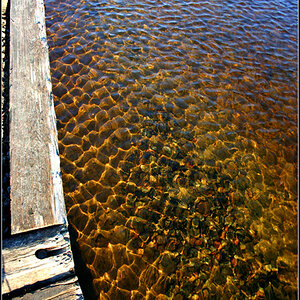
At first I thought it was a wall. I looked closer and realized it was a lake. Your lake sets have been very nice. I like the mood and darkness of this. What settings did you use. Was this at night or did you PP?

It was an hour before it got dark. I updated op with sooc so you can see what was done in pp.
I've just seen that my settings were 1/200 f2 iso 160
 
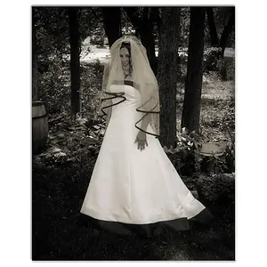
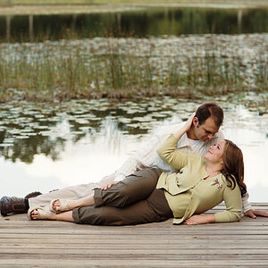
I think everything about this image is spot on... EXCEPT... for the fact that she's almost dead-centre in the frame. Crop ~1/3 of the space image left and this would (IMO) perfect.

I think everything about this image is spot on... EXCEPT... for the fact that she's almost dead-centre in the frame. Crop ~1/3 of the space image left and this would (IMO) perfect.

Sorry, John. Have to respectfully disagree. The central placement is rather key. There are two sets of separators: the land/lake and the lake/background which create the band of thirds. Her model's placement pulls all three together. The break in the symmetry is the dress, moved to the left by the wind. If you place the model at the one third line, the image loses a lot of its power (at least to me).

John, Paul replied to your comment much better than I would be able to :)
Thank you for your thoughts and I still see it as a compliment! :)
 
I think everything about this image is spot on... EXCEPT... for the fact that she's almost dead-centre in the frame. Crop ~1/3 of the space image left and this would (IMO) perfect.

Sorry, John. Have to respectfully disagree. The central placement is rather key. There are two sets of separators: the land/lake and the lake/background which create the band of thirds. Her model's placement pulls all three together. The break in the symmetry is the dress, moved to the left by the wind. If you place the model at the one third line, the image loses a lot of its power (at least to me).
And I willl respectuflly disagree with your disagreement! I'm not suggesting placing the model "in a third" ("on a third"?), rather just moving her horizonantally a bit, away from nearly dead centre. I like the vertical placement, and I agree that too much movement would be harmful, but I think a bit would beneficial.
 
Everything usefu has already been said, great photograph and love the fact that you're having so much fun these days! :)
 
Very nice, you've maintained a subject that pops but kept a very complimentrary colour pallette. Nice framing, exellent shot.
Thank you Pete!

At first I thought it was a wall. I looked closer and realized it was a lake. Your lake sets have been very nice. I like the mood and darkness of this. What settings did you use. Was this at night or did you PP?

It was an hour before it got dark. I updated op with sooc so you can see what was done in pp.
I've just seen that my settings were 1/200 f2 iso 160


Thanks Maria for the info. Keep em coming.
 
The SOOC update seems to be a different frame with the angle and posture of the model being slightly different and the skirt having been caught by a breeze in the original post.
 
And I willl respectuflly disagree with your disagreement! I'm not suggesting placing the model "in a third" ("on a third"?), rather just moving her horizonantally a bit, away from nearly dead centre. I like the vertical placement, and I agree that too much movement would be harmful, but I think a bit would beneficial.
Ok John, it's all good, I just like her to be in the center. ty
:)
 
Everything usefu has already been said, great photograph and love the fact that you're having so much fun these days! :)
:D Thanks Raj!

Very nice, you've maintained a subject that pops but kept a very complimentrary colour pallette. Nice framing, exellent shot.
Thank you Pete!

At first I thought it was a wall. I looked closer and realized it was a lake. Your lake sets have been very nice. I like the mood and darkness of this. What settings did you use. Was this at night or did you PP?

It was an hour before it got dark. I updated op with sooc so you can see what was done in pp.
I've just seen that my settings were 1/200 f2 iso 160


Thanks Maria for the info. Keep em coming.
I certainly will :)
 
The SOOC update seems to be a different frame with the angle and posture of the model being slightly different and the skirt having been caught by a breeze in the original post.
I straightened and cropped it a bit and I added the breeze in hair and dress in post. There was already a bit of dress movement there but I enhanced it in post
 
I like the sooc and the altered one .....except...the wind affected hair has done strange things to her shoulder, even though it is small the dress addition/cloning is a little noticeable...suggestion..get you model to flick her hair and dress shoot that as well as the standing still shot, it will make the masking and layering virtually invisible to the viewer and easier to achieve for you
 
And I willl respectuflly disagree with your disagreement! I'm not suggesting placing the model "in a third" ("on a third"?), rather just moving her horizonantally a bit, away from nearly dead centre. I like the vertical placement, and I agree that too much movement would be harmful, but I think a bit would beneficial.
Ok John, it's all good, I just like her to be in the center. ty
:)
Oh, so just 'cause it's your picture, you get to decide????


:P
 
the second shot is great, the arms out, nice
 
I like the sooc and the altered one .....except...the wind affected hair has done strange things to her shoulder, even though it is small the dress addition/cloning is a little noticeable...suggestion..get you model to flick her hair and dress shoot that as well as the standing still shot, it will make the masking and layering virtually invisible to the viewer and easier to achieve for you
yeah, but I didn't have that in mind while shooting :)

And I willl respectuflly disagree with your disagreement! I'm not suggesting placing the model "in a third" ("on a third"?), rather just moving her horizonantally a bit, away from nearly dead centre. I like the vertical placement, and I agree that too much movement would be harmful, but I think a bit would beneficial.
Ok John, it's all good, I just like her to be in the center. ty
:)
Oh, so just 'cause it's your picture, you get to decide????


:p
LOL :icon_hug:
the second shot is great, the arms out, nice
thanks for your comment!
 
First, it grows on me every time I look at it.

I do wonder though, regarding your comment, "It's not about the lake, I don't care about the lake..." - why take the photo at the lake then? Every element of a photo does matter, as it plays a part in what makes up the whole.

Please don't mistake my curiosity for rudeness :)
 
First, it grows on me every time I look at it.
all I hear is that you like it ;)

I do wonder though, regarding your comment, "It's not about the lake, I don't care about the lake..." - why take the photo at the lake then? Every element of a photo does matter, as it plays a part in what makes up the whole.
well, I see what you're saying...

I did have in my mind the girl on lake of course, and I titled the thread like that... but then after hearing the first comment "I think maybe to dark. You may be going for that effect, but if you didn't title it as you did I would think its a girl facing a brown wall" I asked myself "Is that all the viewer got from the picture!?" If that's the case then I failed. So I changed the title and let others say something without "lake" in it

Hope I managed to explain...
Please don't mistake my curiosity for rudeness :)
oh I wouldn't!
 

Create an account or login to comment

You must be a member in order to leave a comment

Create account

Create an account on our community. It's easy!

Log in

Already have an account? Log in here.

New Topics

Back
Top Bottom